LINE Login button design guidelines
Add a LINE Login button to let your users log in to your application using LINE Login.
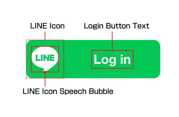
The LINE Login button is made up of the following components: the LINE icon, the LINE icon speech bubble, and the LINE Login button text.
Before using the LINE Login button, make sure you read and agree to the Usage Guidelines for the LINE Login Button. By downloading the following LINE Login button template, you are deemed to have agreed to the guidelines.
Download the LINE Login button template
The file includes multiple sets of images in many resolutions that can be used with web, iOS, or Android applications. Use the PSD file to add customized login text in different languages.
Design guidelines
Use these design guidelines when adding the LINE Login button to your app.
Size
You can increase or decrease the size of the LINE Login button according to the device it will be displayed on as long as the image complies with the following conditions.
- The aspect ratio of the LINE icon does not change.
- The LINE icon remains clearly visible.
Color
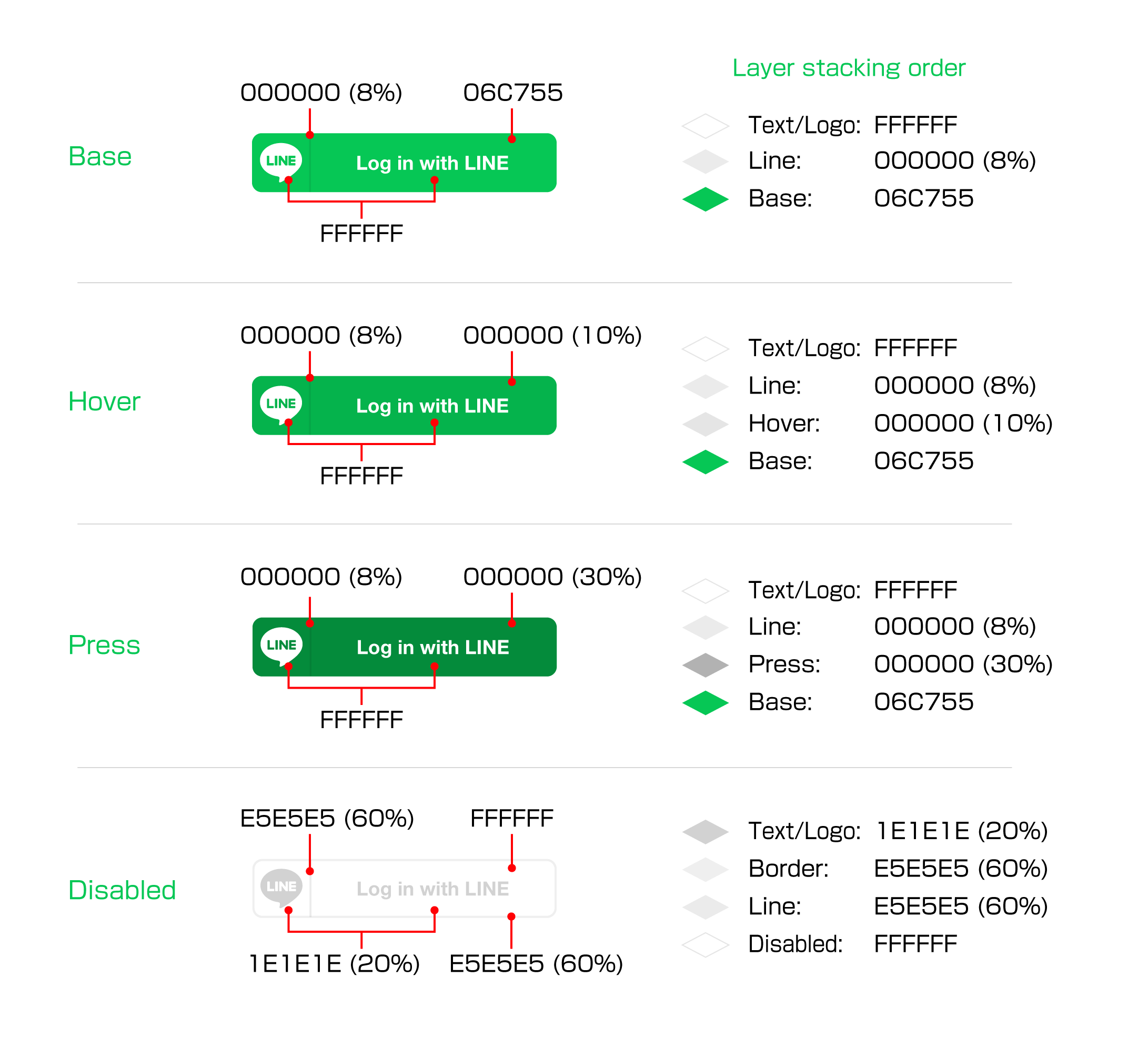
Only the following colors can be used for the LINE Login button.
| Item | Color |
|---|---|
| Base color |  #06C755 #06C755 |
| Hover | #06C755 +  #000000 (opacity: 10%) #000000 (opacity: 10%) |
| Press | #06C755 +  #000000 (opacity: 30%) #000000 (opacity: 30%) |
| Disabled |  #FFFFFF #FFFFFF |
| Font/logo color (other than disabled) | #FFFFFF |
| Font/logo color (only disabled) |  #1E1E1E (opacity: 20%) #1E1E1E (opacity: 20%) |
| Vertical line color (other than disabled) |  #000000 (opacity: 8%) #000000 (opacity: 8%) |
| Vertical line color (only disabled) |  #E5E5E5 (opacity: 60%) #E5E5E5 (opacity: 60%) |
| Border color (only disabled) | #E5E5E5 (opacity: 60%) |
For opacity colors, be aware of the layers you place them on. For example, in the case of a vertical line on the hover button, place the hover (#000000 (opacity: 30%)) on top of the basic color layer (#06C755), and then place the vertical line (#000000 (opacity: 8%)) and text/logo (#FFFFFF) on the layer above it.
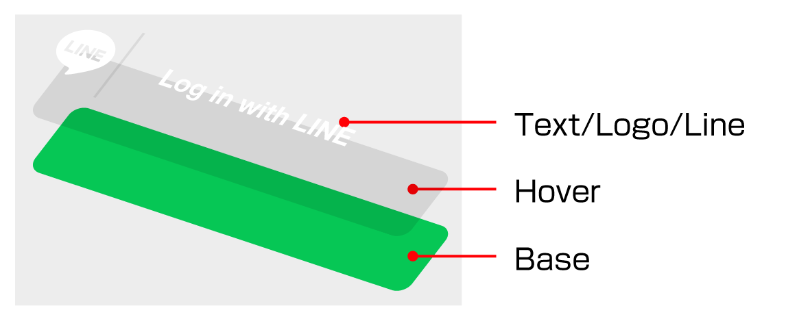
For more information on the placement for each layer, see the below figure.
Text
The recommended LINE login button text is "Log in with LINE". A list of recommended phrases for various languages can be found in the table below.
If you decide to use your own customized button text, make sure to follow these guidelines:
- No line breaks
- Text clearly indicates to the user that the button is for logging into the app with LINE
You can also use the LINE icon on its own without any button text as the LINE Login button.
| Language | Login button text (long) | Login button text (short) |
|---|---|---|
| en | Log in with LINE | Log in |
| ja | LINEでログイン | ログイン |
| ko | LINE으로 로그인 | 로그인 |
| de | Mit LINE anmelden | Anmelden |
| es | Iniciar sesión con LINE | Iniciar sesión |
| fr | Connexion avec LINE | Se connecter |
| id | Masuk dengan LINE | Masuk |
| it | Login con LINE | Login |
| ms | Log masuk dengan LINE | Log Masuk |
| pt-BR | Login com o LINE | Login |
| pt-PT | Iniciar sessão com o LINE | Iniciar sessão |
| ru | Войти в LINE | Войти |
| th | ล็อกอินด้วย LINE | ล็อกอิน |
| tr | LINE ile oturum açın | Oturum Aç |
| ar | تسجيل دخول باستخدام LINE | تسجيل دخول |
| vi | Đăng nhập với LINE | Đăng nhập |
| zh-CN | 用LINE帐号登录 | 登录 |
| zh-TW | 與LINE連動 | 連動 |
Font
The font of the button text must be readable. Recommended font sizes for each image size are included in the PSD files.
Padding
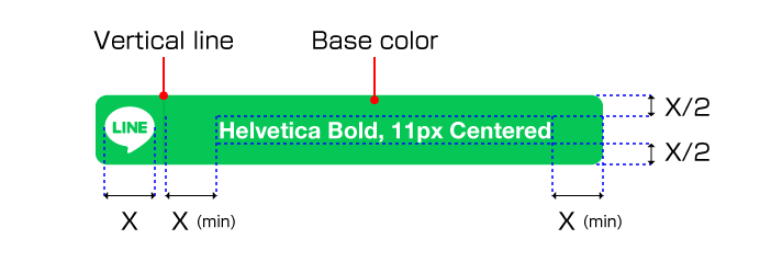
The width of the right and left padding for the login button text must be equal to or greater than the width of the LINE icon speech bubble. This width is defined as X in the image below.
The recommended height of the top and bottom padding for the login button text is X/2. Make sure you use a font size that allows for this padding to be maintained.
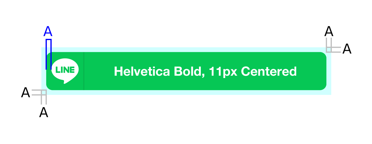
Isolation zone
The isolation zone is the space surrounding the LINE Login button which cannot contain any elements. The width of the isolation zone must be equal to or greater than the left padding of the LINE icon speech bubble. The width is defined as "A" in the image below. In addition to maintaining the isolation zone, avoid placing text or graphics near the isolation zone as that could compromise the effectiveness of the LINE Login button.
Common mistakes to avoid
- Using a non-designated color
- Using an outdated LINE icon
- Using a different or modified icon instead of using the LINE icon