Flex Messages let you create flexible layouts without relying on images. However, line breaks and the amount of visible text may differ even when you use the same JSON. The result depends on the device's screen width, OS, LINE app version, language settings, and fonts.
Part 1 introduced several examples of messages you can send as Flex Messages. This article explains how to create Flex Message layouts that account for display differences between devices.
Product names, store names, event names, and display names can vary in length. If you create a layout with only short sample data, the layout may cut off text or crowd nearby components when you add actual data.
Set wrap to true in a text component to wrap text. Unrestricted text wrapping can make the message too long, so use maxLines to limit the number of lines.
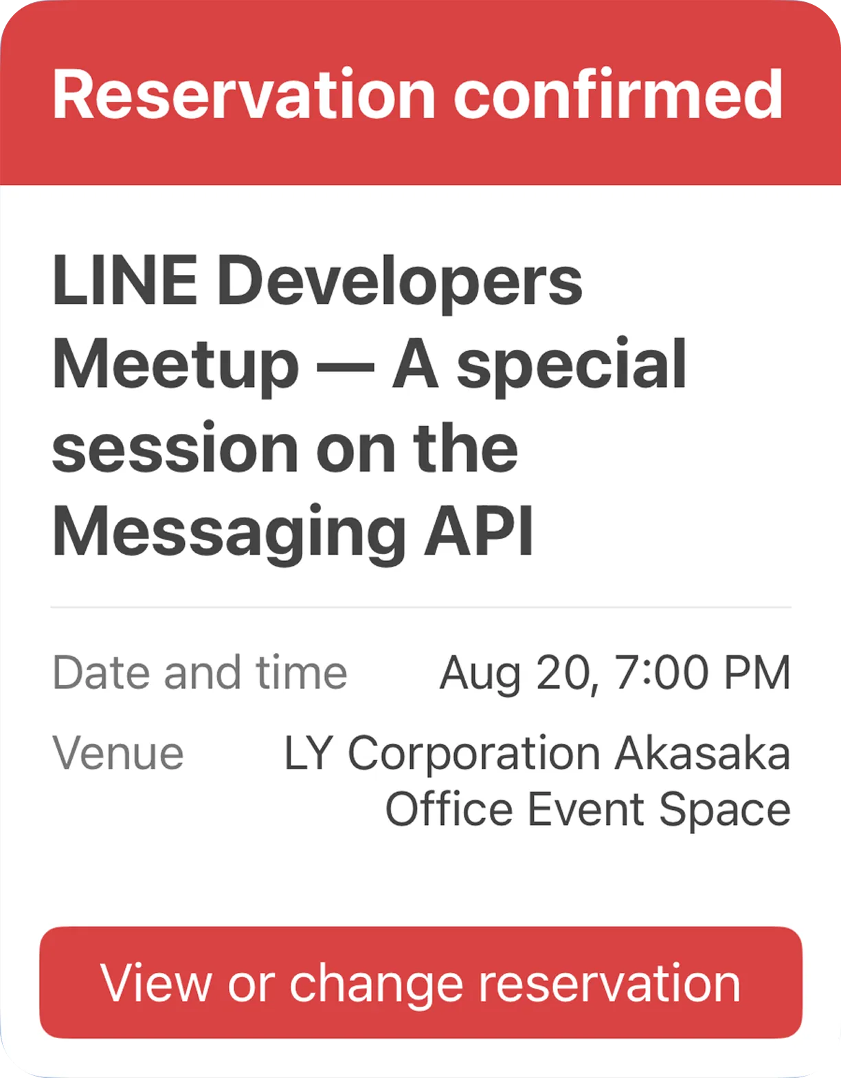
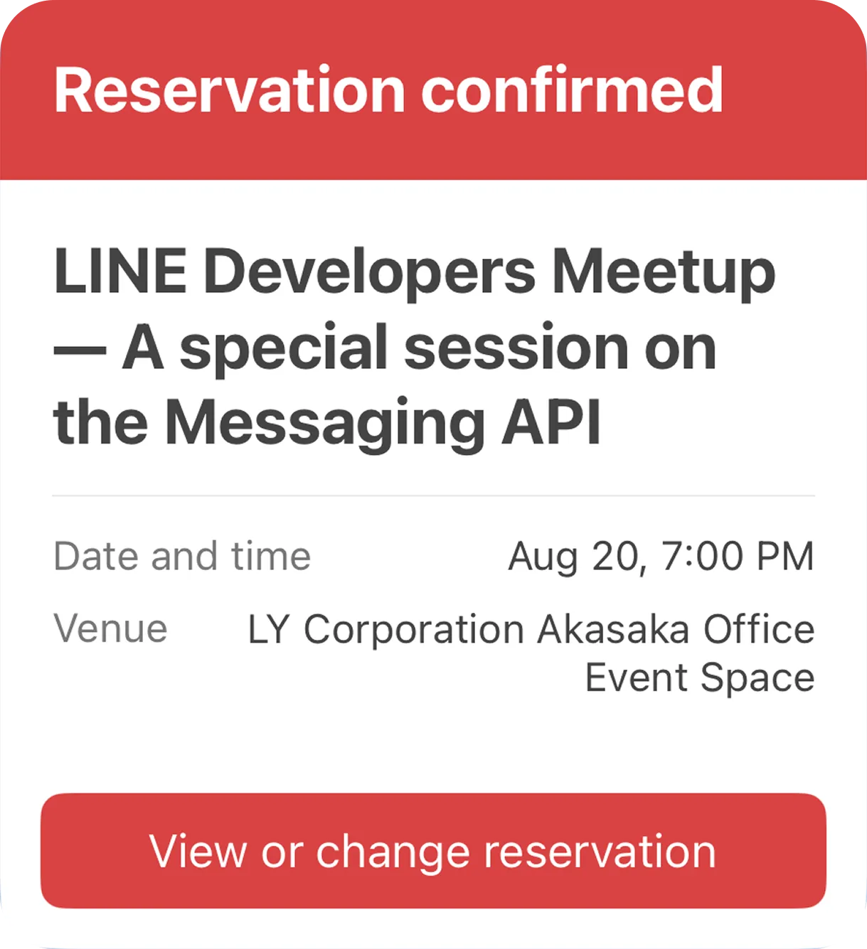
maxLines limits the number of lines, but it doesn't guarantee the number of visible characters. The number of characters on each line varies with the device's screen width, OS, language settings, and fonts. Line breaks may differ between devices even when you set maxLines: 2. If the text doesn't fit within the limit, devices may show different numbers of characters or cut off the text at different points. For more information, see Wrap text.
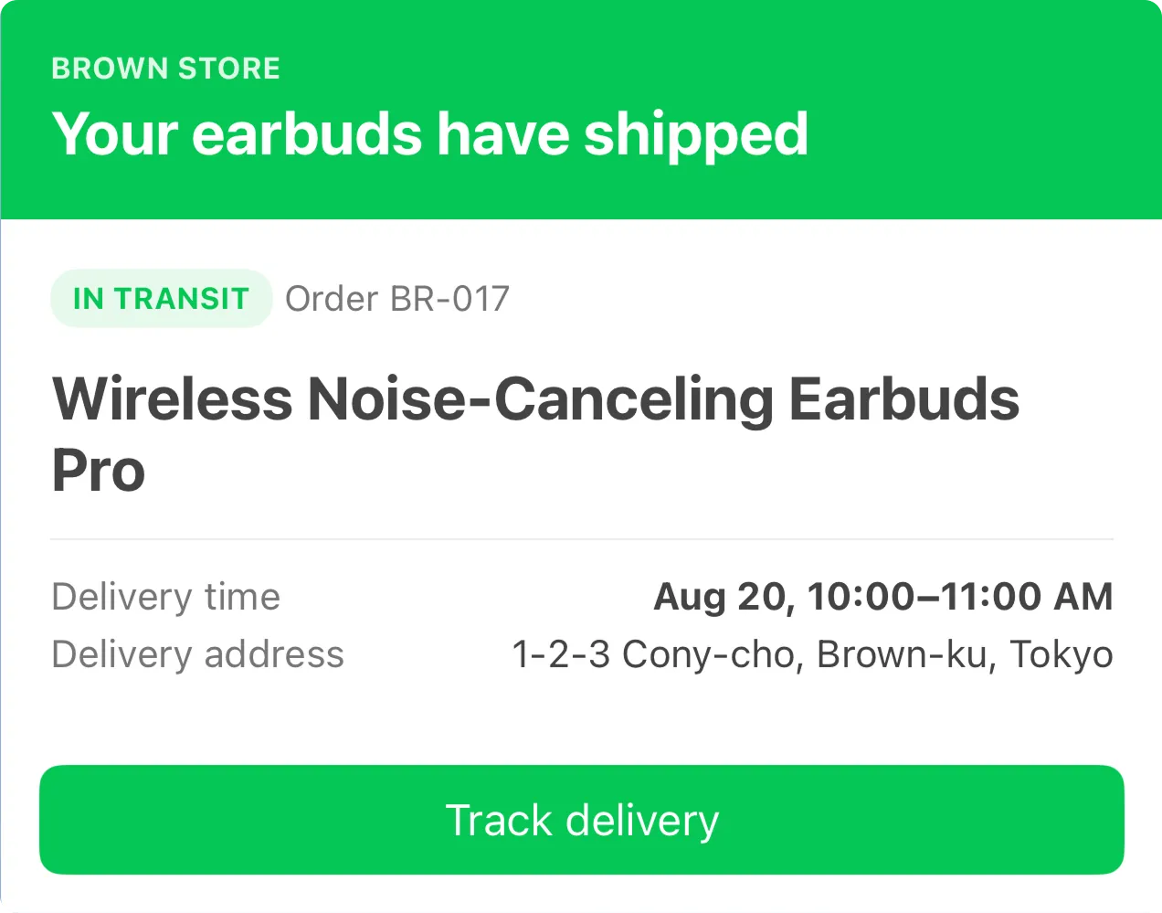
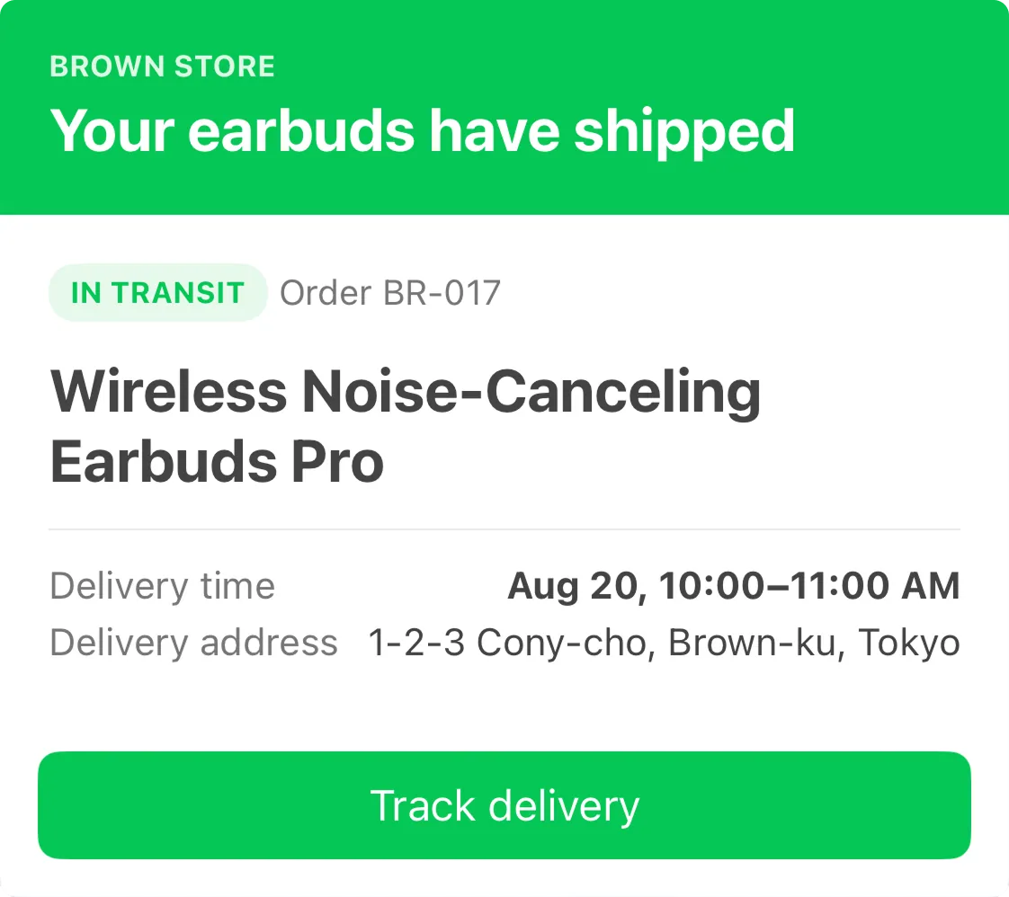
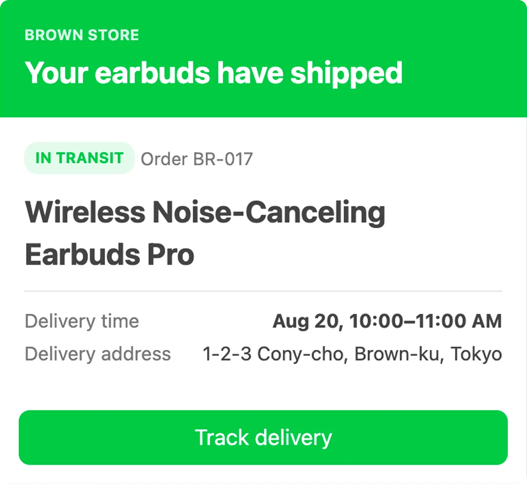
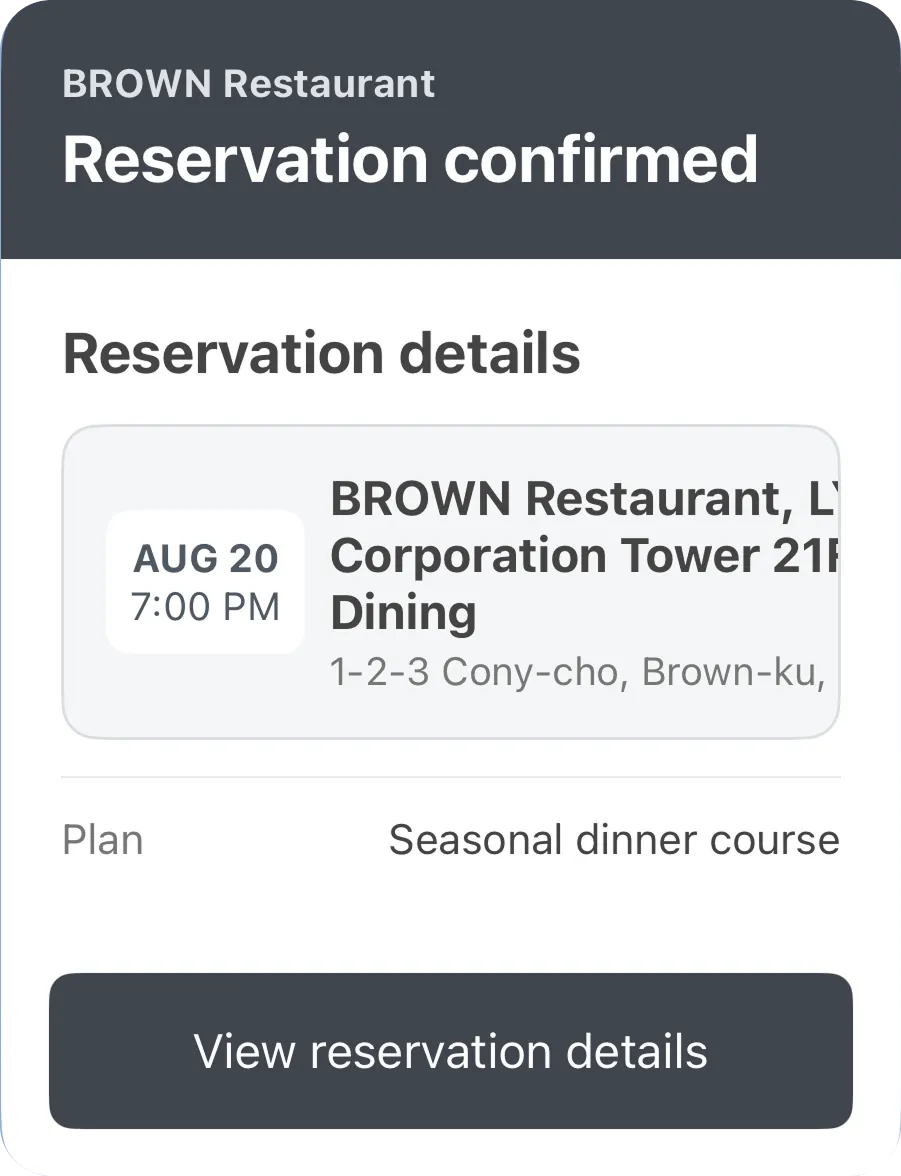
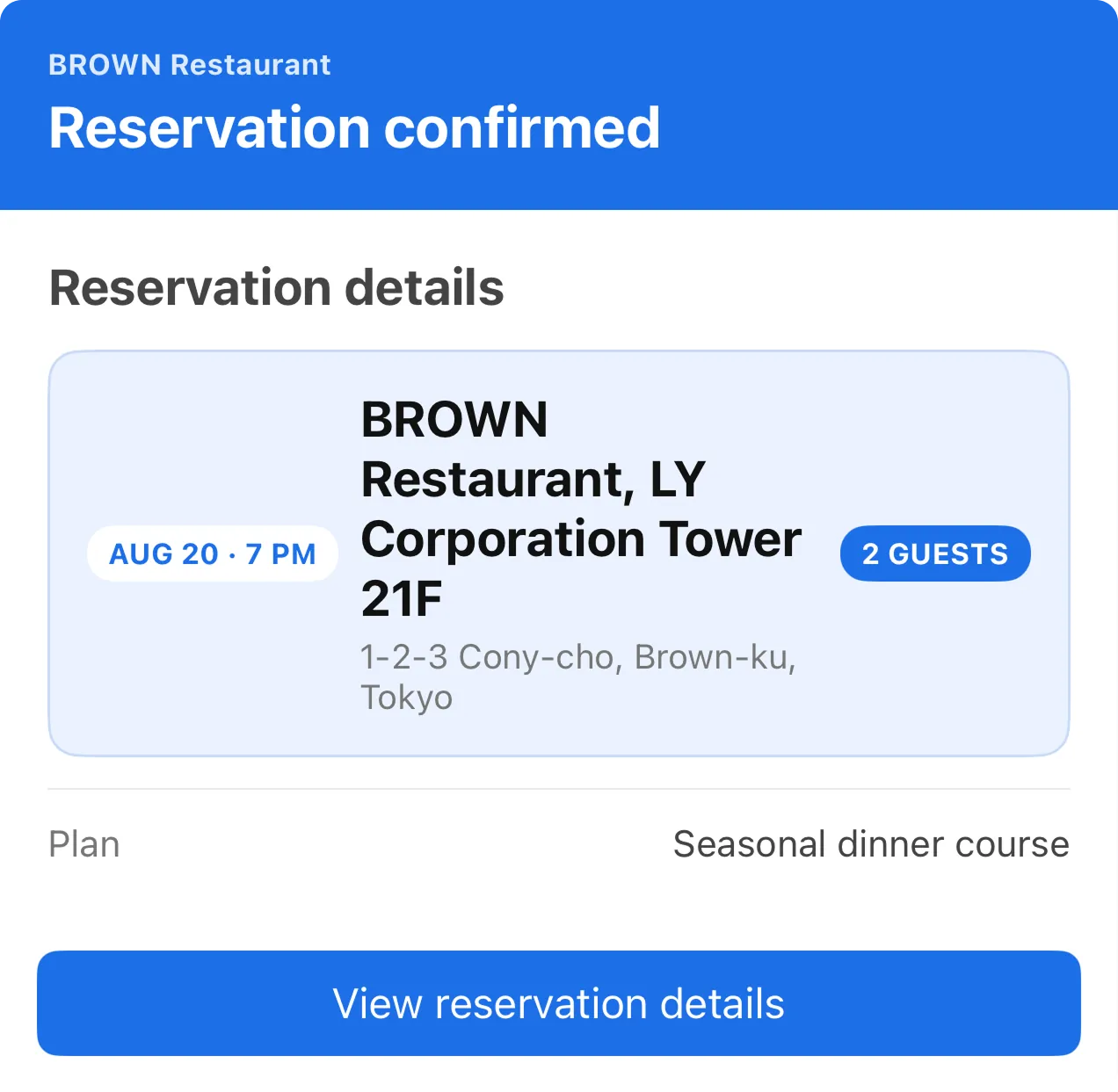
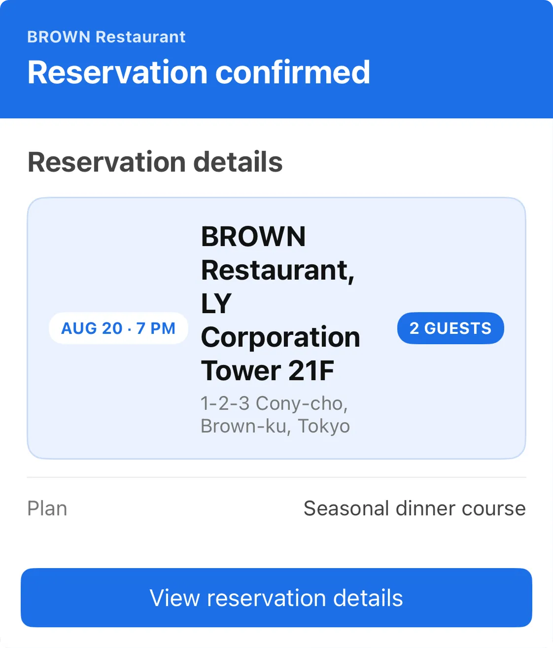
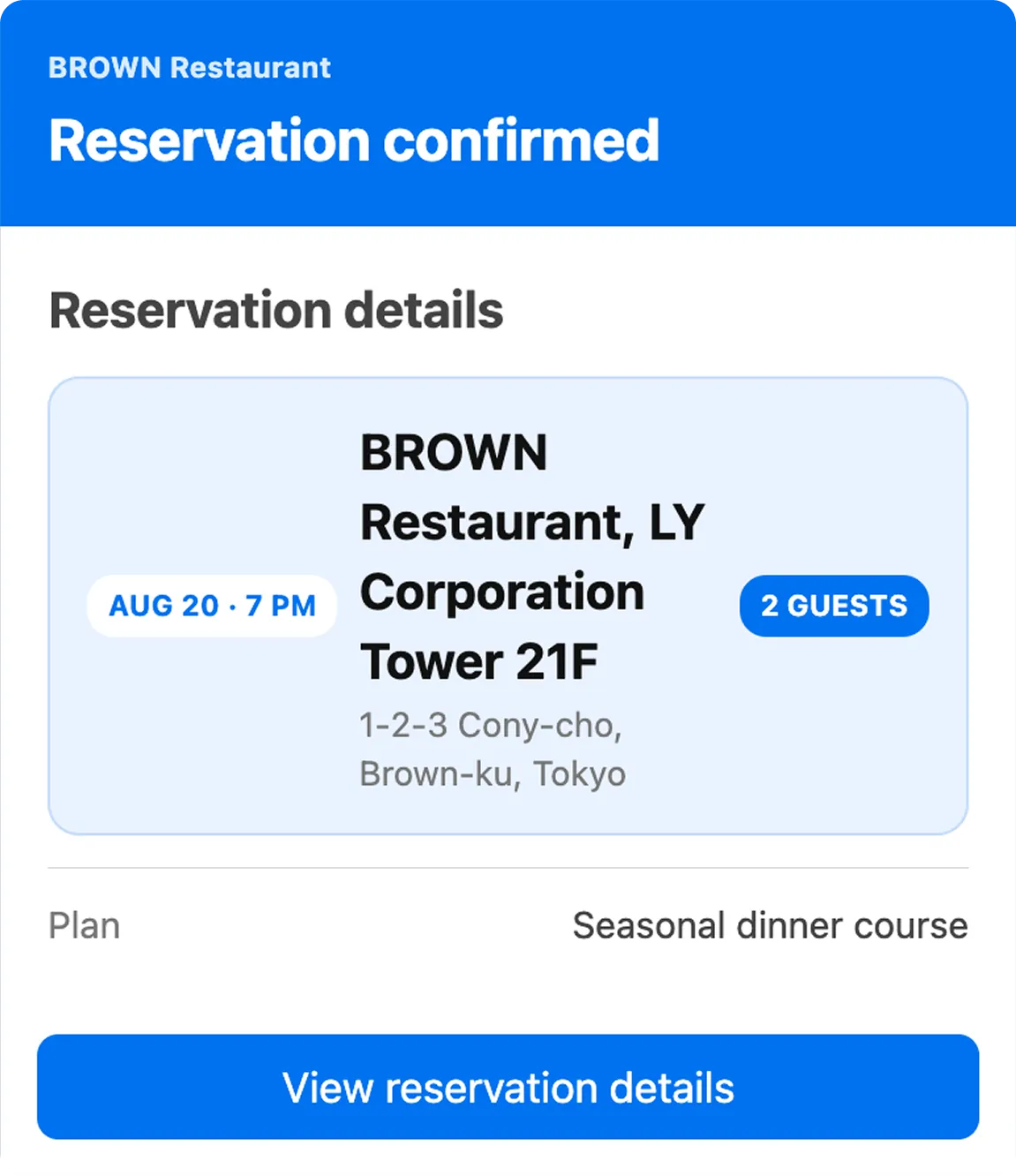
These examples show different line breaks in the same Flex Message with maxLines: 2.
A horizontal box divides its available width among its child components. Variable-length text, such as an address or store name, may wrap earlier on a narrow screen when you place it next to other components. This can change the height of the entire box.
When you set the flex property of a child box that contains variable-length text to 0, the child box occupies the width required to show all its content, up to the width of the parent box.
Content that extends beyond the parent box may not appear. Set flex: 0 for child boxes that contain short labels. Set flex: 1 for child boxes that contain variable-length text and set wrap: true for the text inside them. These settings give the remaining width to the boxes with flex: 1 and let their text wrap.
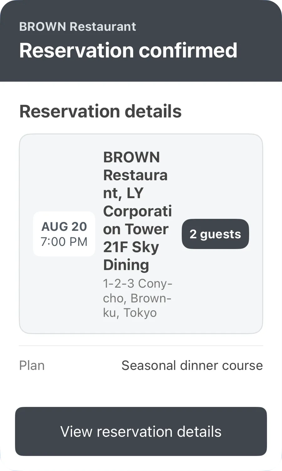
These examples compare a child box that uses flex: 0 with one that uses flex: 1 and contains text with wrap: true.
flex: 0
flex: 1 and wrap: true
The store information takes the width it needs. The end of the store name and the 2 guests box don't appear.
The store name and address wrap within the remaining width. All information appears.
This JSON defines the flex: 0 example on the left. To create the example on the right, change the flex property of the box that contains the store information to 1.
Set the scaling property of text, buttons, and icons to true. Their font and icon sizes then scale with the font size you choose in the LINE app. With a larger font size, text may wrap earlier or change a component's height.
You can set the adjustMode property to shrink-to-fit for buttons and text. However, adjustMode works on a best-effort basis. Its behavior may differ between platforms, or it may not work.
These examples show components with different scaling values. They use Extra large for the font size in the LINE app for iOS. Both buttons use adjustMode: shrink-to-fit.
scaling: true
scaling: false
Set scaling to true and design the layout so that important information remains readable when the font size changes. Don't set scaling to false just to prevent layout changes.
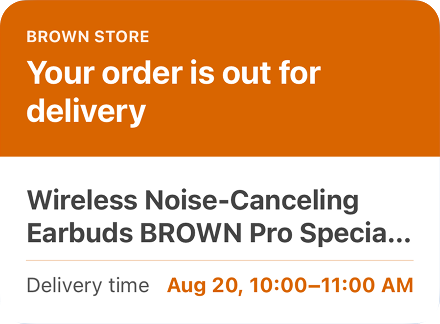
Place important information in separate text components. This includes payment deadlines, reservation dates and times, and order statuses. Don't include this information in long product names or descriptions. Separate components keep important information visible even when the layout cuts off other text.
This example shows a Flex Message on an iOS device. It places the product name and the expected delivery time in separate components.
Don't set a fixed pixel width for a layout with variable-length text. A fixed width can reduce visible text on some screens. When you set the position property to absolute, the component doesn't affect the placement of other components. This can cause components to overlap. Separate important information from variable-length text. Place it in a standard layout that uses the flex property.
Flex Messages offer great layout flexibility. You also need to account for display differences caused by screen widths and font sizes. Use maxLines to limit the number of lines when necessary. Use flex and wrap to wrap variable-length text. Place important information in separate components so it remains clear when the amount of visible text changes.
Don't check only the final appearance when you create a Flex Message. Add long text and check that important information remains visible. Change the screen width and check that components don't overlap or disappear. Change the font size and check that the message remains readable.