Flex Message layout
You can build complex Flex Messages layouts based on the specification for CSS Flexible Box (CSS flexbox). The flex container and flex items in CSS flexbox correspond to the box component and the Flex Message components, respectively.
Learn how to compose a layout of your Flex Message. For more information about the JSON schema, see Flex Message in the Messaging API reference.
Box component orientation
Box components have two orientations, landscape and portrait. Boxes in landscape mode are called horizontal boxes and those in portrait mode are called vertical boxes. The orientation determines the main axis and cross axis of a box. The main axis is parallel to the orientation. A horizontal box's main axis is horizontal and a vertical box's main axis is vertical. The cross axis is perpendicular to the main axis. The main axis determines how a box's child components are arranged. For more information, see Child component arrangement with free space.
You need to specify the orientation in the layout property of the box component. In addition to horizontal boxes and vertical boxes, baseline boxes are available.
| Box | layout property | Main axis | Cross axis | Child components placed |
|---|---|---|---|---|
| Horizontal box | horizontal | Horizontal | Vertical | Horizontally |
| Vertical box | vertical | Vertical | Horizontal | Vertically |
| Baseline box | baseline | Horizontal | Vertical | Horizontally For more information, see Child components in baseline boxes. |
Child components in baseline boxes
Baseline boxes behave in the same way as horizontal boxes. However, the behavior of baseline boxes differs from that of horizontal boxes in the following ways:
Vertical alignment position
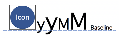
Components in a baseline box are vertically aligned by the same baseline. This means all the child components use the same baseline, regardless of the font size. The baseline of an icon component is the bottom of the icon image.
Unavailable properties
You can't use the properties gravity and offsetBottom in child components of a baseline box component.
Available child components
A box's layout property determines which components you can use as child components of a box component:
| Baseline box | Horizontal box Vertical box | |
|---|---|---|
| Box | ❌ | ✅ |
| Button | ❌ | ✅ |
| Image | ❌ | ✅ |
| Icon | ✅ | ❌ |
| Text | ✅ | ✅ |
| Span (Using as a child of a text component is okay) | ❌ | ❌ |
| Separator | ❌ | ✅ |
| Filler (deprecated) | ✅ | ✅ |
✅: You can use this component in the box ❌: You can't use the component in the box
Component size
If a component's position property is set to relative, the component's width and height are determined by the flex property of the component.
- Width allocation in a horizontal box
- Height allocation in a vertical box
- Box width
- Maximum width of a box
- Box height
- Maximum height of a box
- Image size
- Icon, text, and span size
- Size of other components
- Automatically shrink fonts to fit
- Scaling to size according to the font size setting
Width allocation in a horizontal box
Child components in a horizontal box that have the flex property set to 1 or greater share the parent box's width with sibling components. The default value of the flex property is 1. The proportion of width each child component gets is determined by the value of the child component's flex property against the sum of the values of the flex properties.
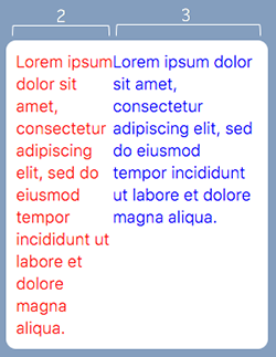
Suppose a horizontal box has two components, one with the flex property set to 2 and the other to 3. Then the available width (the width of the horizontal box) is divided at a ratio of two to three and allocated to each component.
The JSON definition of this Flex Message example is as follows.
If a component's flex property is 0, the component occupies the width required to show all of the component's content, within the box's width. However, the part that goes outside the box's width isn't displayed.
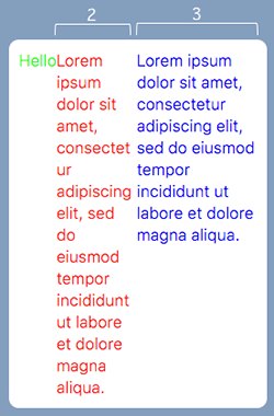
For example, suppose we have a horizontal box with three child components, each with its flex property set to 0, 2, and 3, respectively. The first component has the flex property set to 0, so the component takes up the width to fit its text, "Hello". Then the rest of the available width is shared between the remaining two components, in the ratio of 2 to 3, as illustrated below.
The JSON definition of this Flex Message example is as follows.
The flex property of a child component in a horizontal box matches the flex property of CSS flexbox as follows:
Value of the flex property of Flex Message's child component | Corresponding CSS flexbox style |
|---|---|
0 | flex: 0 0 auto; |
0 or greater | flex: X 0 0; (where X is the value of the child component's flex) |
Height allocation in a vertical box
Child components in a vertical box that have the flex property set to 1 or greater share the parent box's height with sibling components. The default value of the flex property is 0. The proportion of height each child component gets is decided by the value of their flex property against the sum of the values of the flex properties.
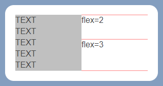
In the example below, a horizontal box has two vertical boxes. The first vertical box has a text that takes up five lines and the second vertical box has two pieces of texts and three separators.
Each component is laid out according to the rules given below:
- The vertical box on the left has a height of five rows. This sets the height of the vertical box on the right to be the same.
- The child components in the vertical box on the right don't need to occupy the whole height, resulting in some free space.
- The free space is split up and assigned to the two text components at a 2:3 ratio based on the value of their
flexproperty (2and3, respectively).
The JSON definition of this Flex Message example is as follows.
The flex property of a child component in a vertical box matches the flex of CSS flexbox as follows:
Value of the flex property of Flex Message's child component | Corresponding CSS flexbox style |
|---|---|
0 | flex: 0 0 auto; |
0 or greater | flex: X 0 auto; (where X is the value of the child component's flex) |
Box width
You can specify a box width with the width property, in pixels or as a percentage to the parent component's width. If you specify the width of a child box inside a horizontal box, the child box's flex property is set to 0.
A bubble's width depends on the size of the device screen. If you specify the width property in pixels to adjust the overall layout of a bubble, you may have an unexpected layout in the end. We recommend that you use the flex property to be less affected by the device screen size.
Maximum width of a box
You can specify the maximum width of a box with the maxWidth property, in pixels or as a percentage to the parent component's width. The maxWidth takes precedence over the width property. The box width is set to the value of the maxWidth property if the width calculated with the width property is greater than the one calculated with the maximum.
Box height
You can specify the box height with the height property, in pixels or as a percentage to the parent component's height. If you specify the height of a child box inside a horizontal box, the child box's flex property is set to 0.
Maximum height of a box
You can specify the maximum height of a box with the maxHeight property, in pixels or as a percentage to the parent component's height. The maxHeight takes precedence over the height property. The box height is set to the value of maxHeight property if the height calculated with the height property is greater than the one calculated with the maximum.
Image size
You can set the width of an image component with the size property, in pixels, as a percentage, or with a keyword. The height is automatically adjusted to retain the aspect ratio (specified in the aspectRatio property).
| Unit | Accepted values | Examples |
|---|---|---|
| Percentage | Percentage to the original image's width, expressed as a positive integer or decimal number suffixed with %. | 50% 23.5% |
| Pixels | Positive integer or decimal number suffixed with px. | 50px 23.5px |
| Keywords | Any of these values, listed in order of increasing size: xxs, xs, sm, md, lg, xl, xxl, 3xl, 4xl, 5xl, full | md (Default) |
Icon, text, and span size
You can specify the size for icon, text, and span components with the size property, in pixels or with a keyword. You can't specify a percentage.
| Unit | Accepted values | Examples |
|---|---|---|
| Pixels | Positive integer or decimal number suffixed with px. | 50px 23.5px |
| Keywords | Any of these values, listed in order of increasing size: xxs, xs, sm, md, lg, xl, xxl, 3xl, 4xl, 5xl | md (Default) |
Size of other components
For components such as button, you can specify the component size with a property other than flex. For more information on the JSON schema, see Flex Message in the Messaging API reference.
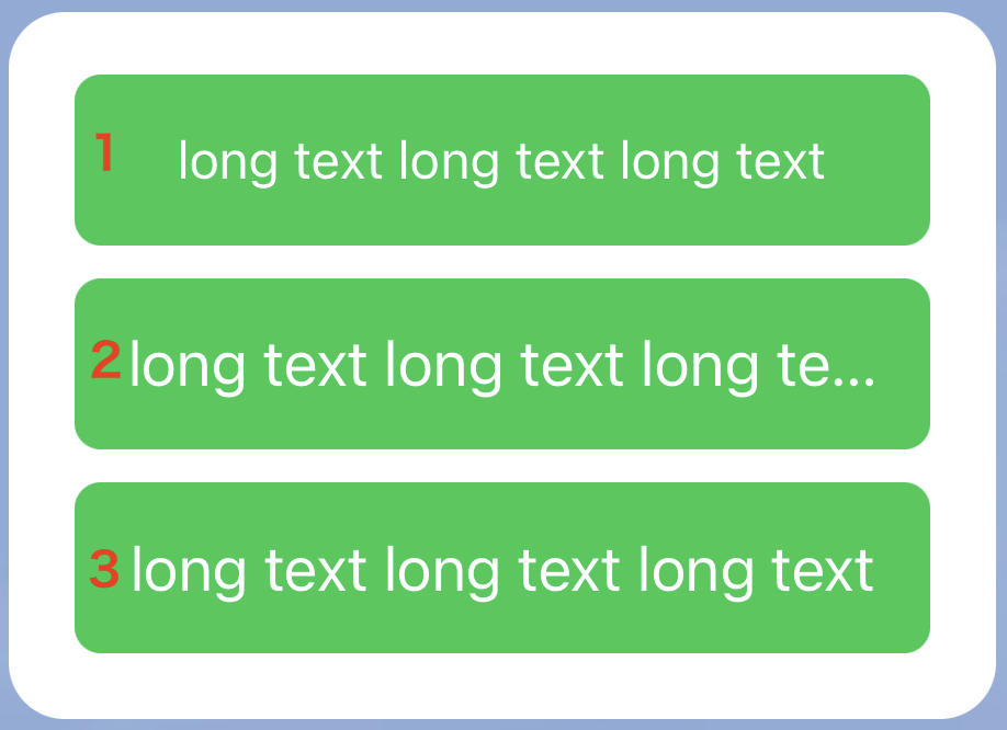
Automatically shrink fonts to fit
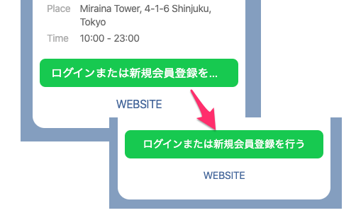
If you specify a value of shrink-to-fit for the adjustMode property of button and text components, the text's font size will automatically shrink to fit. The adjustMode property takes a "best-effort" approach that may work differently—or not at all!—on some platforms.
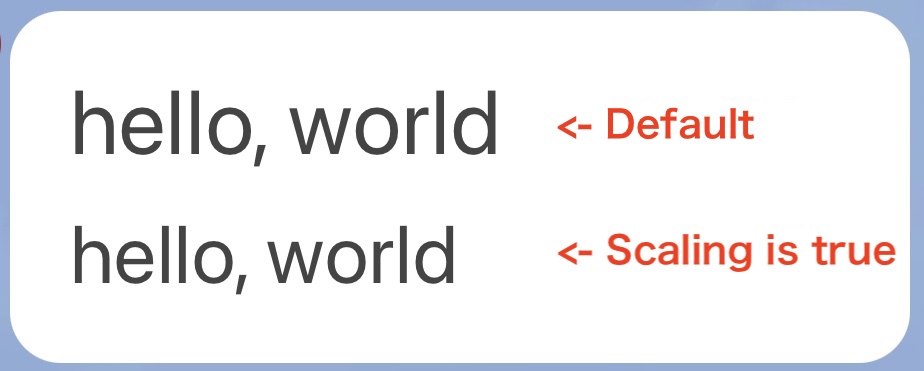
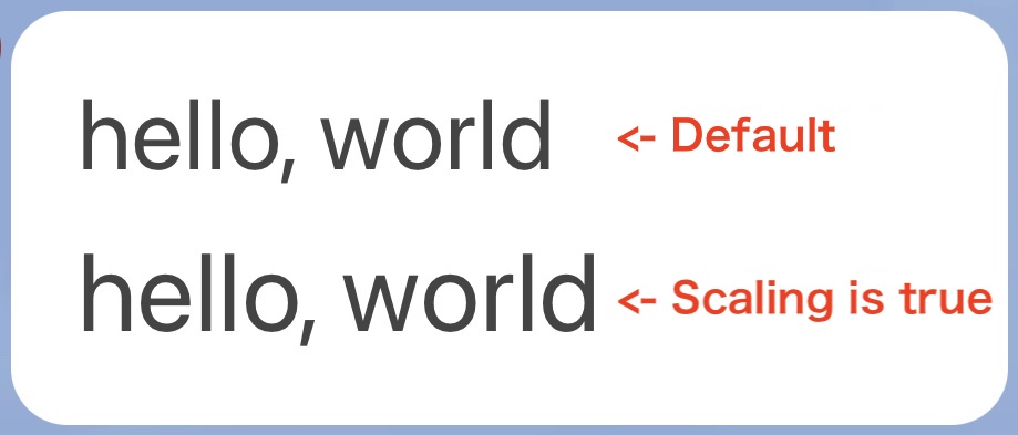
Scaling to size according to the font size setting
If you set the scaling property to true of a Flex Message button, text, or icon, you can automatically scale the font size and icon size according to the font size setting of the LINE app. This allows you to send messages with accessibility in mind.
| Example of font size Small | Example of font size Extra large |
|---|---|
 |  |
The JSON definition of this Flex Message example is as follows.
In a button and text, you can set the scaling property to true and the adjustMode property to shrink-to-fit. In this case, when the text width exceeds the component width due to the automatic scaling of the font size, the font size will be shrunk to fit the component width.
The following is an example of the Extra Large font size of the LINE app.
| dummy | dummy |
|---|---|
 |
|
Component position
If a box with child components has a remaining space, you can align each child component horizontally or vertically.
To position child components, use the parent component's padding or the child component's margin property. You can distribute child components on the main axis and also on cross axis. Offset is another option you can use to position your child components.
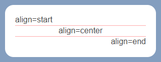
Horizontally align text or images
To align your text or image components horizontally, use the align property. The orientation of the parent component has no effect on this property. Available alignment options are:
- Align to the left:
start - Align to the right:
end - Align at the center:
center(Default)
The JSON definition of this Flex Message example is as follows.
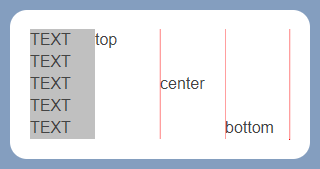
Vertically align text, images, or button
To align your text, image, or button components vertically, use the gravity property. The orientation of the parent component has no effect on this property. Available alignment options are:
- Align to the top:
top(Default) - Align to the bottom:
bottom - Align at the middle:
center
The gravity property is ignored if the component is a child of a baseline box.
The JSON definition of this Flex Message example is as follows.
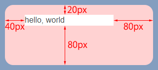
Position child component with box padding
You can position your child component in a box component with the padding of the box component. Padding allocates space between the parent component's border and the child component. Available padding properties are paddingAll, paddingTop, paddingBottom, paddingStart, and paddingEnd. Padding can be specified in pixels, percentage (to the parent box width) or with a keyword.
| Unit | Accepted values | Examples |
|---|---|---|
| Percentage | Percentage to the parent box's width, with a positive integer or decimal number suffixed with %. | 50% 23.5% |
| Pixels | Positive integer or decimal number suffixed with px. | 50px 23.5px |
| Keywords | Any of these values, listed in order of increasing size: none (no padding), xs, sm, md, lg, xl, xxl | md (Default) |
The properties paddingTop, paddingBottom, paddingStart, and paddingEnd take precedence over the paddingAll property. If properties paddingTop, paddingBottom, paddingStart, or paddingEnd are specified, the paddingAll property is ignored.
The JSON definition of this Flex Message example is as follows.
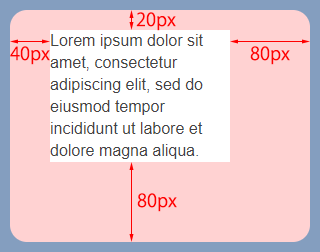
A longer text with the same padding is displayed as shown below.
Child component arrangement with free space
You can arrange child components with the remaining space in a box, by axis. Learn how to distribute child components by the main axis and cross axis.
The properties justifyContent and alignItems set how child components are placed along the main and cross axes, respectively. The direction of the main and cross axes are determined by the parent box component.
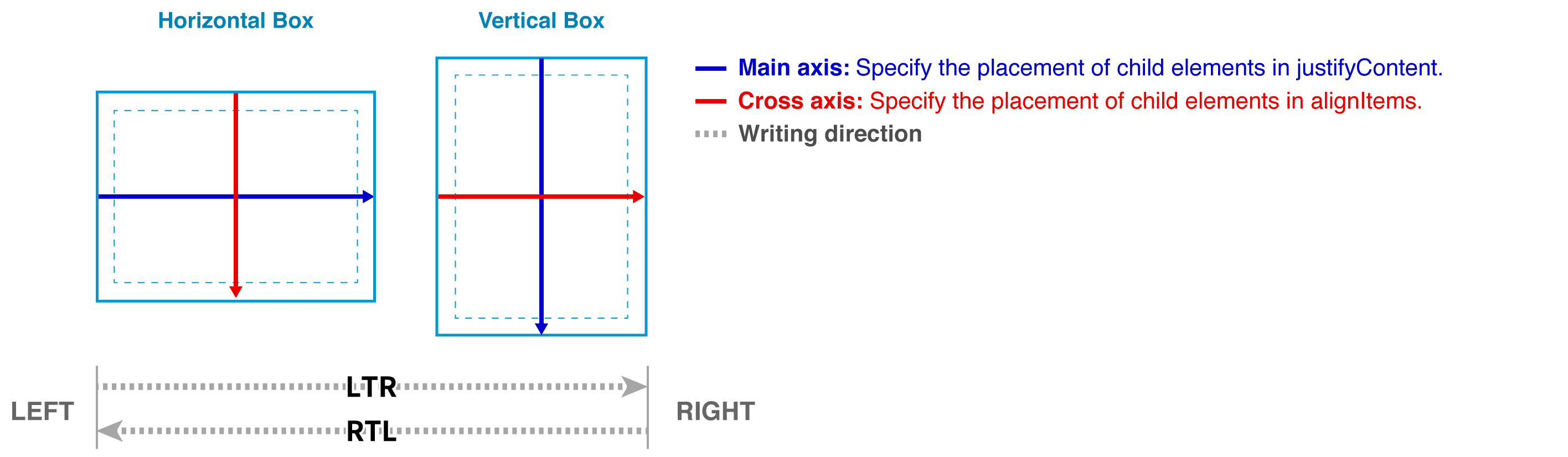
The text direction (LTR or RTL) is always applied horizontally no matter what the orientation of the parent box component is.
Distribute child components on main axis
To distribute child components in a box along the main axis, use the justifyContent property. The direction of the main axis is horizontal for horizontal boxes and vertical for vertical boxes. For this property to take effect, the flex property of all child components must be 0. Because if any one of the child components have the flex property of 1 or greater, then child components expand to fill the parent box. This means that there is no space to distribute child components. Be aware that by default, child components in a horizontal box gets 1 for the flex property.
See how child components in a horizontal box with LTR text direction are distributed by the value of the justifyContent property.


| Property value | Child component distribution |
|---|---|
flex-start | Horizontal box: Grouped at where the text begins in the parent component Vertical box: Grouped toward the top of the parent component |
center | Grouped at the center of the parent component |
flex-end | Horizontal box: Grouped at where the text ends in the parent component Vertical box: Grouped toward the bottom of the parent component |
space-between | Evenly distributed in the parent component, with the first and last child components at each edge of the parent component. The gap between child components are even. |
space-around | Evenly distributed in the parent component. Remaining space in the parent component is divided by 2 x number of components. Each child component gets a divided space on its left and right. |
space-evenly | Evenly distributed in the parent box. Remaining space in the parent component is evenly distributed between both sides of each child component. |
The JSON definition of a Flex Message set with flex-start is as follows.
Arranging child components along the cross axis with the alignItems property
To distribute child components in a box along the cross axis, use the alignItems property. The direction of the cross axis is vertical for horizontal boxes and horizontal for vertical boxes.
See how child components in a horizontal box with LTR text direction are distributed by the value of the alignItems property.


| Property value | Child component distribution |
|---|---|
flex-start | Horizontal box: Aligned at the top of the parent component Vertical box: Grouped at where text begins in the parent component |
center | Located at the middle of the parent component |
flex-end | Horizontal box: Grouped at the bottom of the parent component. Vertical box: Grouped at where text ends in the parent component |
The JSON definition of a Flex Message set with flex-start is as follows.
spacing property for boxes
You can specify the minimum space between two components with the spacing property of the parent box component, in pixels or with a keyword. You can't specify a percentage.
| Unit | Accepted values | Examples |
|---|---|---|
| Pixels | Positive integer or decimal number suffixed with px. | 50px 23.5px |
| Keywords | Any of these values, listed in order of increasing size: none (no space), xs, sm, md, lg, xl, xxl | md |
This example Flex Message has a horizontal box with three vertical boxes as child components, spaced evenly (md).
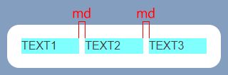
The JSON definition of this Flex Message example is as follows.
To override this setting for a specific component, set the margin property of that component.
margin property of components
You can specify the minimum space before a child component with the margin property of the child component, in pixels or with a keyword. You can't specify a percentage.
| Unit | Accepted values | Examples |
|---|---|---|
| Pixels | Positive integer or decimal number suffixed with px. | 50px 23.5px |
| Keywords | Any of these values, listed in order of increasing size: none (no margin), xs, sm, md, lg, xl, xxl | md |
The margin property takes precedence over the parent box's spacing property. Also, if the margin property is specified for the first child component in a box, the space is allocated before the component.
This example Flex Message has a horizontal box with three vertical boxes as child components. The parent horizontal box has the spacing property set to md. The third vertical box has the margin property set to xxl.
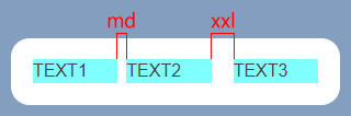
The JSON definition of this Flex Message example is as follows.
Offset
A different option to position your component is using offset. The offset properties work differently by the value of the parent component's position property, which can be relative or absolute. But the first child component of a block can't be absolute.
The offset properties you can use are offsetTop, offsetBottom, offsetStart, and offsetEnd. You can specify the property value in pixels, or keywords (none, xs, sm, md, lg, xl, or xxl). You can also specify the percentage to the box width for offsetStart and offsetEnd and to the box height for offsetTop and offsetBottom.
Learn how offset changes the position of the box labeled as "TARGET" below.
The JSON definition of this Flex Message example is as follows.
Offset when position is relative
To shift your component from the component's original position, set the position property to relative. For more information, see Relative positioning of CSS Positioned Layout Module Level 3.
| Property | Description |
|---|---|
offsetTop | Shifts the component down from the top edge of the component's original position. |
offsetBottom | Shifts the component up from the bottom edge of the component's original position. |
offsetStart | Shifts the component away from the where the text starts. If the bubble's text direction is LTR, shift is to the right. If RTL, shift is to the left. |
offsetEnd | Away from the where the text ends. If the bubble's text direction is LTR, shift is to the left. If RTL, shift is to the right. |
The component labeled "TARGET" in its original position is shown on the first image. The component shifted by the position and offset properties are shown on the second image.
To shift your component like in the example, set the properties as specified below.
| Property | Value |
|---|---|
position | relative |
offsetTop | 10px |
offsetBottom | - |
offsetStart | 40px |
offsetEnd | - |
The JSON definition of the Flex Message example is as follows.
Offset when position is absolute
To shift your component from the parent component's edges, set the position property to absolute. For more information, see Absolute positioning of CSS Positioned Layout Module Level 3.
| Property | Description | |
|---|---|---|
offsetTop |
Specifies the relative position from the upper end of the parent component to the upper end of the component. | |
offsetBottom |
Specifies the relative position from the lower end of the parent component to the lower end of the component. | |
offsetStart |
If the text directionality in the bubble is LTR | Specifies the relative position from the left end of the parent component to the left end of the component. |
| If the text directionality in the bubble is RTL | Specifies the relative position from the right end of the parent component to the right end of the component. | |
offsetEnd |
If the text directionality in the bubble is LTR | Specifies the relative position from the right end of the parent component to the right end of the component. |
| If the text directionality in the bubble is RTL | Specifies the relative position from the left end of the parent component to the left end of the component. | |
If you don't specify the offset properties, the position of the component may vary by device. We recommend that you specify the offsets both vertically (offsetTop or offsetBottom) and horizontally (offsetStart or offsetEnd).
The component labeled "TARGET" in its original position is shown on the first image. The component shifted by the position and offset properties are shown on the second image.
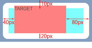
To shift your component like the example, set the properties as specified below.
| Property | Value |
|---|---|
position | absolute |
offsetTop | 10px |
offsetBottom | 20px |
offsetStart | 40px |
offsetEnd | 80px |
The JSON definition of the Flex Message example is as follows.
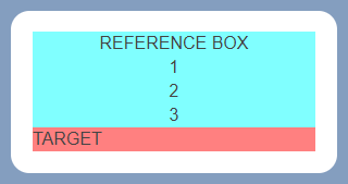
Size of child and parent components with absolute position
A child box component with the position property set to absolute doesn't change the size of the parent component. Likewise, the component isn't resized by the parent component. If a component is larger than the parent component, the parts that fall outside the parent component isn't displayed.
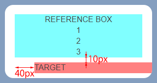
Let's compare the effect of absolute and relative positions. The "REFERENCE BOX" component, a horizontal box on the first image has its position set to relative. The same component with the position set to absolute is shown on the second image.
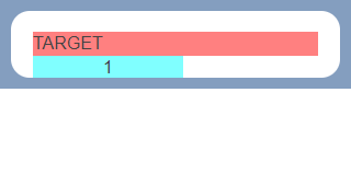
As you can see on the example on the second image, the size of "REFERENCE BOX" doesn't affect the size of the parent component (vertical box), and is also not affected by the parent component. Therefore, the portions larger than the parent component (rows "2" and "3") aren't displayed. Moreover, the free space on the left and right that has become larger due to the effect of the parent component (free space) returns to its original size (width of the text "REFERENCE BOX").
Linear gradient backgrounds
You can set the background of a box component with a linear gradient. Specify linearGradient for the background.type property. Learn how to set the gradient angle and color stops.
The parent component's text direction (LTR or RTL) has no effect on the direction of the gradient.
Angle of linear gradient
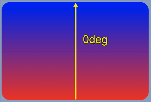
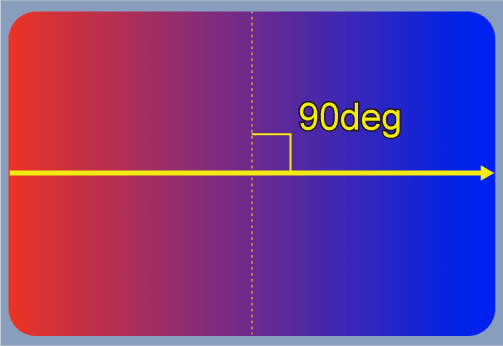
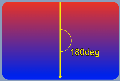
You can specify the linear gradient's angle as an integer or decimal number from 0 to less than 360 degrees. To set the angle to 90 degrees, specify the angle as 90deg and 23.5deg for 23.5 degrees. The direction of gradient changes by the angle:
- 0 degrees: Bottom to top
- 45 degrees: Bottom left to top right
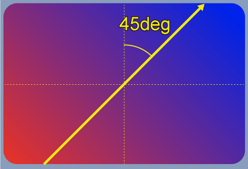
- 90 degrees: Left to right
- 180 degrees: Top to bottom
The direction rotates clockwise as the angle increases.
Linear gradient at 0 degrees (Bottom to top)
The JSON definition of the Flex Message example is as follows.
Linear gradient at 45 degrees (Bottom-left to top-right)
Linear gradient at 90 degrees (Left to right)
Linear gradient at 180 degrees (Top to bottom)
For more information, see Box in the Messaging API reference.
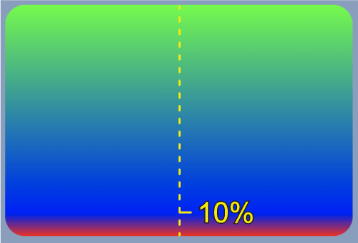
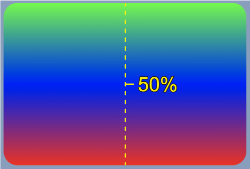
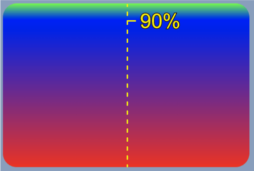
Gradient color stops
To add a color stop to a gradient, that is, to make the gradient have three colors, specify the centerColor property. You can specify the centerPosition property for the position of the color stop.
Color stop at the 10% mark
The JSON definition of the Flex Message example is as follows.
Color stop at the 50% mark
Color stop at the 90% mark
Rendering order
Components are rendered in the order specified in JSON. The component in the beginning of the JSON definition is rendered first. And then the next component is rendered on top of the previous component. So the last component is rendered at the very top layer of the bubble.
To change the rendering order, change the order of components in the JSON definition.
Learn more
- Send Flex Messages
- Flex Message elements
- Flex Message (Messaging API reference)