Flex Message elements
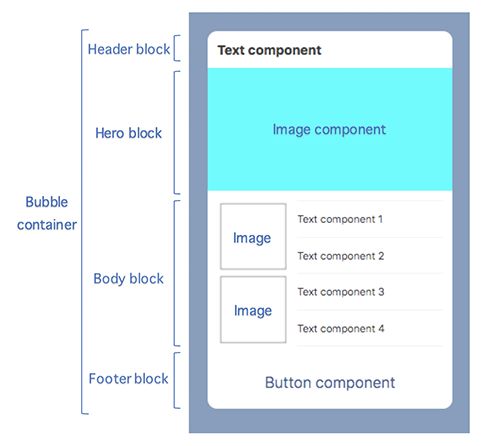
Flex Messages have a hierarchical structure for building blocks, in three levels. The top level is container, followed by blocks (header, hero, body, footer) and then components. This page explains elements constituting a Flex Message through an example.
Container
Container is the top-level building block of Flex Messages. Available container types are:
| Type | Description |
|---|---|
| Bubble | A container that displays a single message bubble |
| Carousel | A container that displays multiple message bubbles, laid out side by side |
Bubble
Bubble is a container that contains only one instance of a message bubble. For more information about the JSON schema, see Bubble in the Messaging API reference.
Carousel
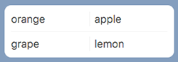
Carousel is a container that contains multiple bubbles. You can browse the bubbles in a carousel by scrolling sideways.
The JSON definition of this Flex Message example is as follows. For more information about the JSON schema, see Carousel in the Messaging API reference.
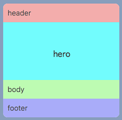
Block
Block is a unit that composes a bubble. Available block types are:
| Type | Description |
|---|---|
| Header | Block that displays the message subject or header |
| Hero | Block that displays the main image |
| Body | Block that displays the main message |
| Footer | Block that displays buttons and supplementary information |
The order of placement is from header, hero, body, and footer. You don't have to use all block types in one message bubble. But if used, the block type can be used only once in a message bubble. For more information about the JSON schema, see the properties header, hero, body, and footer in the Bubble in the Messaging API reference.
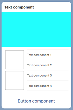
The JSON definition of this Flex Message example is as follows:
Component
Component is a unit that composes a block. Available components are:
| Component | Description |
|---|---|
| Box | This component defines a horizontal or vertical layout orientation and holds components together. |
| Button | This component renders a button. When the user taps a button, a specified action is performed. |
| Image | This component renders an image. |
| Video | This component renders a video. |
| Icon | This component renders an icon. |
| Text | This component renders a text string. You can specify the font color, size, and weight. |
| Span | This component renders multiple text strings in different styles. You can specify the font color, size, weight, and decoration. |
| Separator | This component renders a separating line. |
| Filler (deprecated) | This component renders an empty space. |
Box
This component defines a horizontal or vertical layout orientation and holds components together. Any component can be contained, including a box. For more information on layout information, see Flex Message layout. For more information on the JSON schema, see Box in the Messaging API reference.
Button
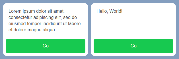
This component renders a button. You can set an action to be executed when a user taps the button. You have three button styles to choose from as shown below. You can change the color of the button of all button styles.
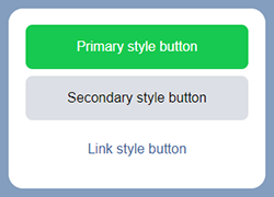
The JSON definition of this Flex Message example is as follows. For more information about the JSON schema, see Button in the Messaging API reference.
Image
This component renders an image.
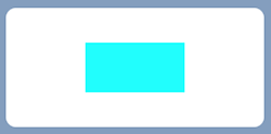
The JSON definition of this Flex Message example is as follows. For more information about the JSON schema, see Image in the Messaging API reference.
Video
This component renders a video. For more information on using videos, see Create a Flex Message including a video.

The JSON definition of this Flex Message example is as follows. For more information about the JSON schema, see Video in the Messaging API reference.
Icon
This component renders an icon for decorating the adjacent text. You can use this component only in a baseline box.
The JSON definition of this Flex Message example is as follows. For more information about the JSON schema, see Icon in the Messaging API reference.
Text
This component renders a text string. You can specify the color, size, and weight of the text. You can wrap long text and adjust the line spacing for wrapped text.
The JSON definition of this Flex Message example is as follows. For more information about the JSON schema, see Text in the Messaging API reference.
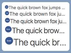
Text wrapping
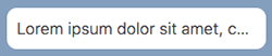
By default, overflowing text is truncated with an ellipsis. This is an example of how a long text gets displayed.
The JSON definition of this Flex Message example is as follows.
To avoid truncation, you can wrap long text. To apply text wrapping, set the wrap property to true. You can make a part of the text begin from a new line, with a new line character (\n). This is an example of a Flex Message with text wrapping and a new line character.
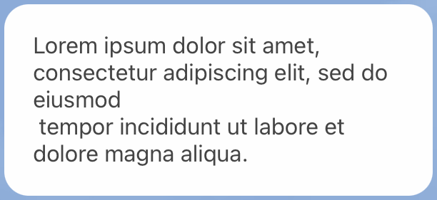
The new line character (\n) at the end of a text can be rendered differently by the device environment.
The JSON definition of the text wrapping example is as follows. The wrap property is added with a value of true.
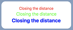
Line spacing in a text
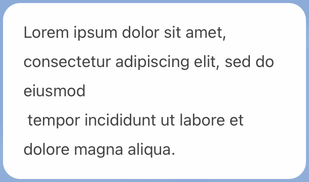
When you wrap a text, you can specify the line spacing of a wrapped text with the lineSpacing property.
Line spacing isn't applied to the top of the first line and the bottom of the last line.
The JSON definition of this Flex Message example is as follows. The lineSpacing property is added with a value of 20px.
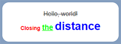
Span
This component renders multiple text strings in different styles. You can specify the color, size, weight, and decoration of each text. Span is set to contents property of texts.
The JSON definition of this Flex Message example is as follows. For more information about the JSON schema, see Span in the Messaging API reference.
Separator
This component renders a separating line inside a box. A vertical line is drawn if included in a box with the horizontal layout. Similarly, a horizontal line is drawn if included in a box with the vertical layout.
The JSON definition of this Flex Message example is as follows. For more information about the JSON schema, see Separator in the Messaging API reference.
Filler
To add a space, use the properties of each component instead of adding fillers. For more information, see Component position.
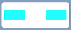
This component renders an empty space. You can put a space in between, before, or after components within a box. The example below illustrates a box with two images and a filler in between the images.
The JSON definition of this Flex Message example is as follows. For more information about the JSON schema, see Filler in the Messaging API reference.
Learn more
- Send Flex Messages
- Flex Message layout
- Flex Message (Messaging API reference)