Tutorial - Create a digital business card with Flex Message Simulator
Flex Messages are messages that can be freely customized based on CSS Flexible Box (CSS Flexbox). Depending on your needs, you can adjust the size of the message, allocate text, images, and icons in specific locations, and add interactive buttons.
In this tutorial, you'll learn how to use Flex Message Simulator to create a digital business card. Flex Message Simulator is a tool to help you brainstorm, design, and prototype Flex Messages without writing code. If you are new to Flex Messages, see Sending Flex Messages first.
Goal
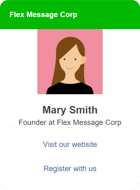
The outcome of this tutorial is a digital business card as shown below. You can see the outcome defined in JSON from this download link. But we recommend that you to go through this tutorial to become familiar with Flex Message Simulator. We guarantee, this tool will become quite handy to deal with a limitless number of use cases for Flex Messages.
Before you start
To follow this tutorial, we recommend that you read Messaging API overview and Send Flex Messages, before you get started. Also, read on this section to learn about Flex Message Simulator if you are new to the simulator. If you're familiar with the simulator, start with the tutorial right now.
Learn about Flex Message Simulator
Flex Message Simulator is a tool with which you can compose and preview a Flex Message. You don't have to set up a development environment or write code to compose Flex Messages and send Flex Messages to preview.
First, open Flex Message Simulator. If you aren't logged in to the LINE Developers Console, you're prompted to log in. If you have a LINE Developers account, log in with your account. If not, click Create an account and create one.
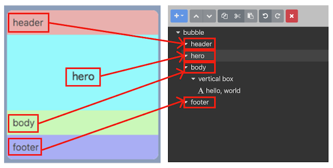
The UI of Flex Message Simulator has three areas:
- Preview area: Displays the Flex Message generated with the data specified in the tree view area and property area.
- Tree view area: Displays and lets you edit the data structure of the Flex Message.
- Property area: Lets you set the properties of the item selected in the tree view area. The simulator uses the data entered here to generate a Flex Message.
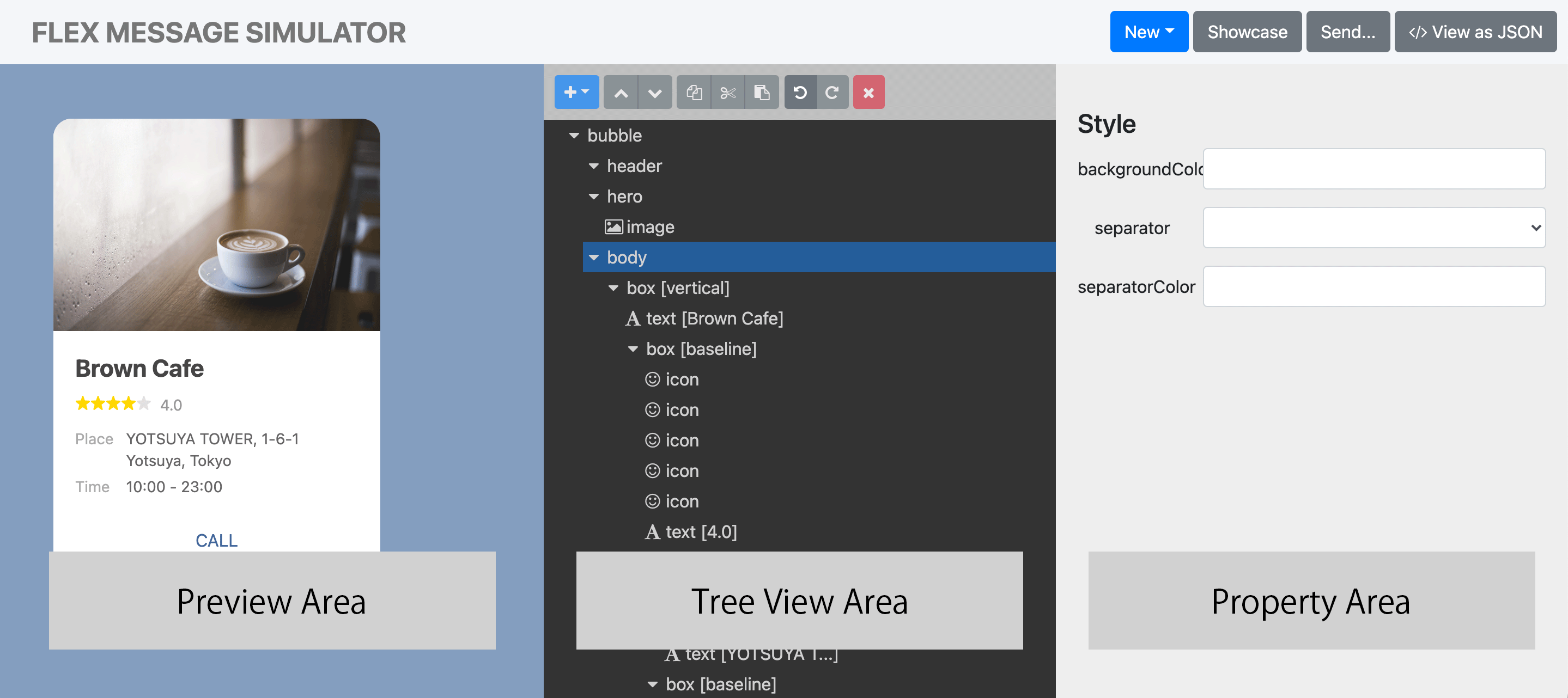
If you hover your mouse over an item in the tree view area, the corresponding area is highlighted in the preview area. See this in action from the video.
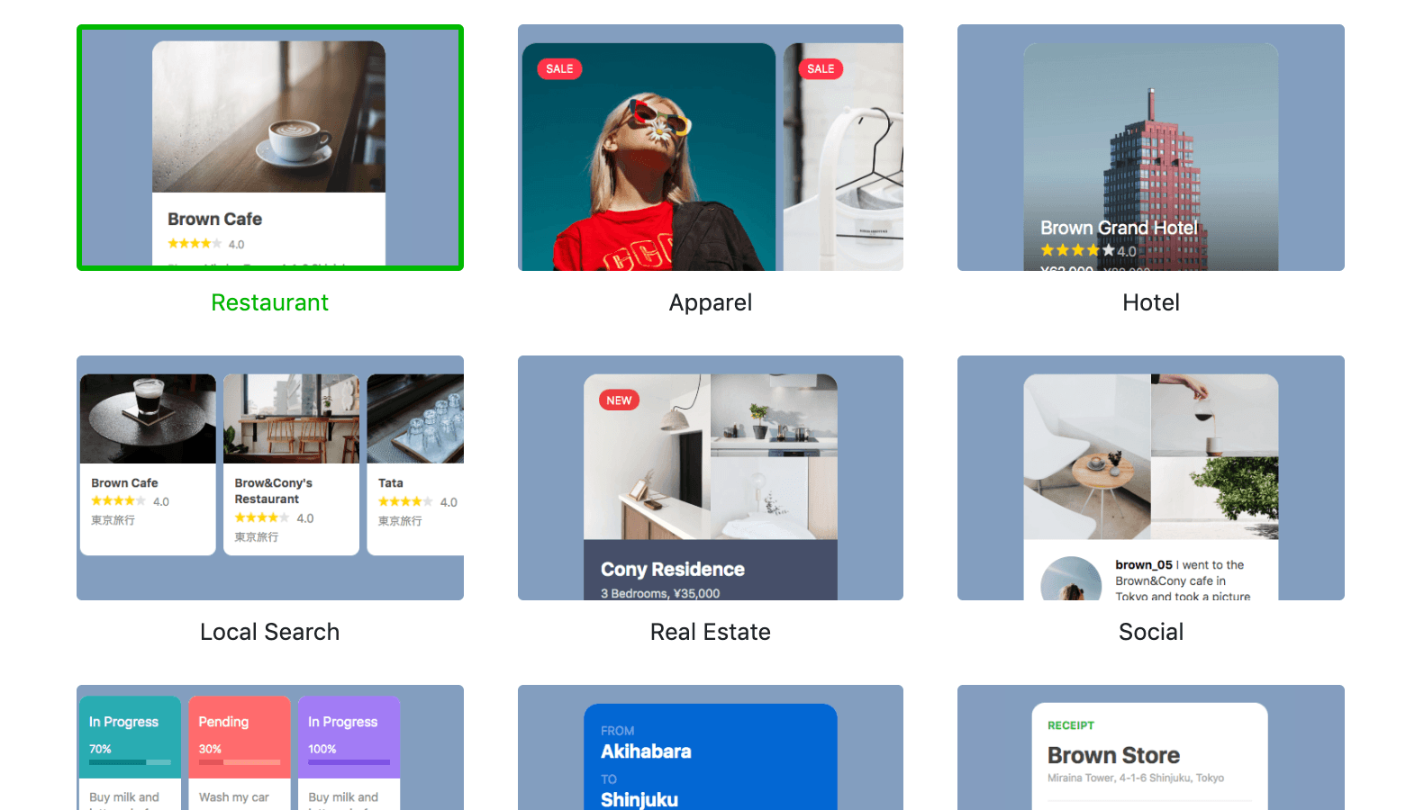
You can use Flex Message layout presets
Flex Message Simulator offers predefined Flex Message layouts.
To use a predefined layout, click Showcase at the top of the simulator. Once you make a choice, click Create.
In this tutorial, we don't use a predefined layout. We'll create a Flex Message from scratch.
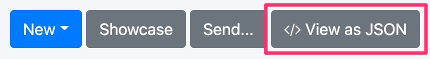
You can copy the Flex Message in JSON
To copy a Flex Message generated in JSON, click </>View as JSON and then the Copy button.
Tutorial shortcut
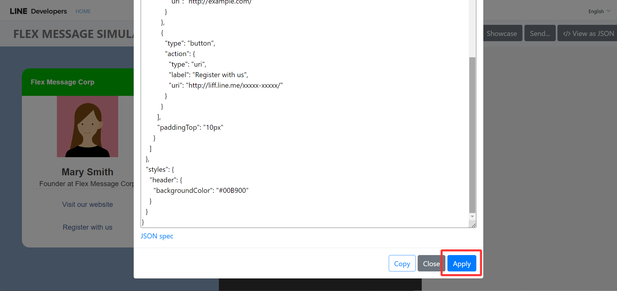
To skip reading through the instructions and jump right to preview the outcome, download the Flex Message object in JSON. To preview the outcome in Flex Message Simulator:
- Click </>View as JSON. A modal with JSON data is displayed.
- Remove the content in the modal.
- Copy and paste the content of the downloaded JSON file into the modal.
- Click Apply to save the change. The preview area shows the Flex Message we pasted in.
1. Select container type
Now that we learnt about Flex Message Simulator, let's get started to create a digital business card. We only need one bubble to create a business card, so we'll set our Flex Message container to the bubble type.
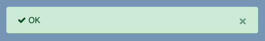
To create a bubble container, click New and select bubble from the drop-down menu.
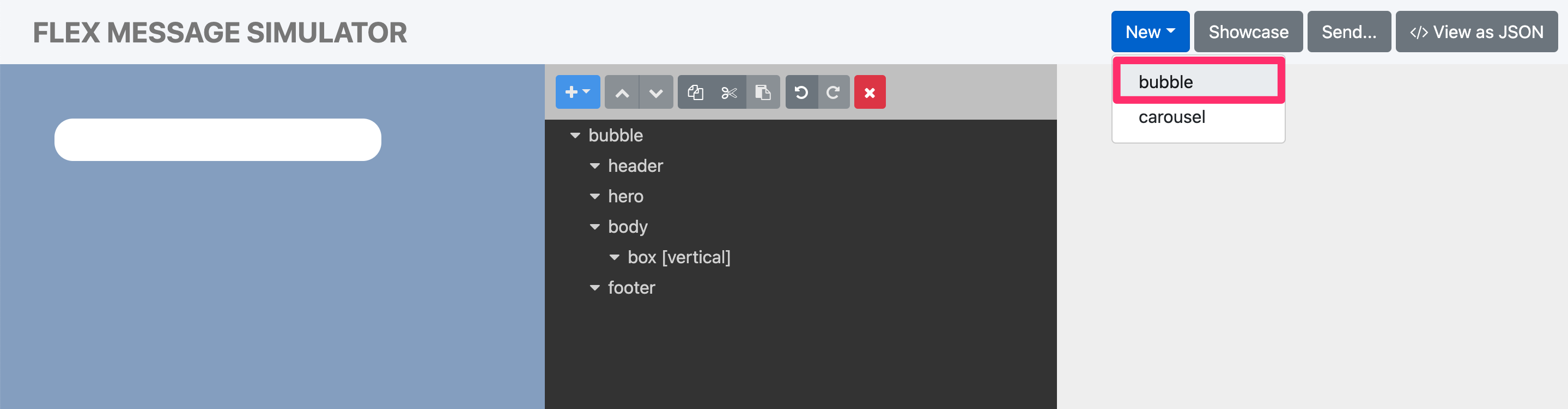
When you select bubble from the drop-down menu, an "OK" message pops up at the bottom of the preview area. This means that your update is successfully reflected in the preview area.
For more information about the types of containers, see container.
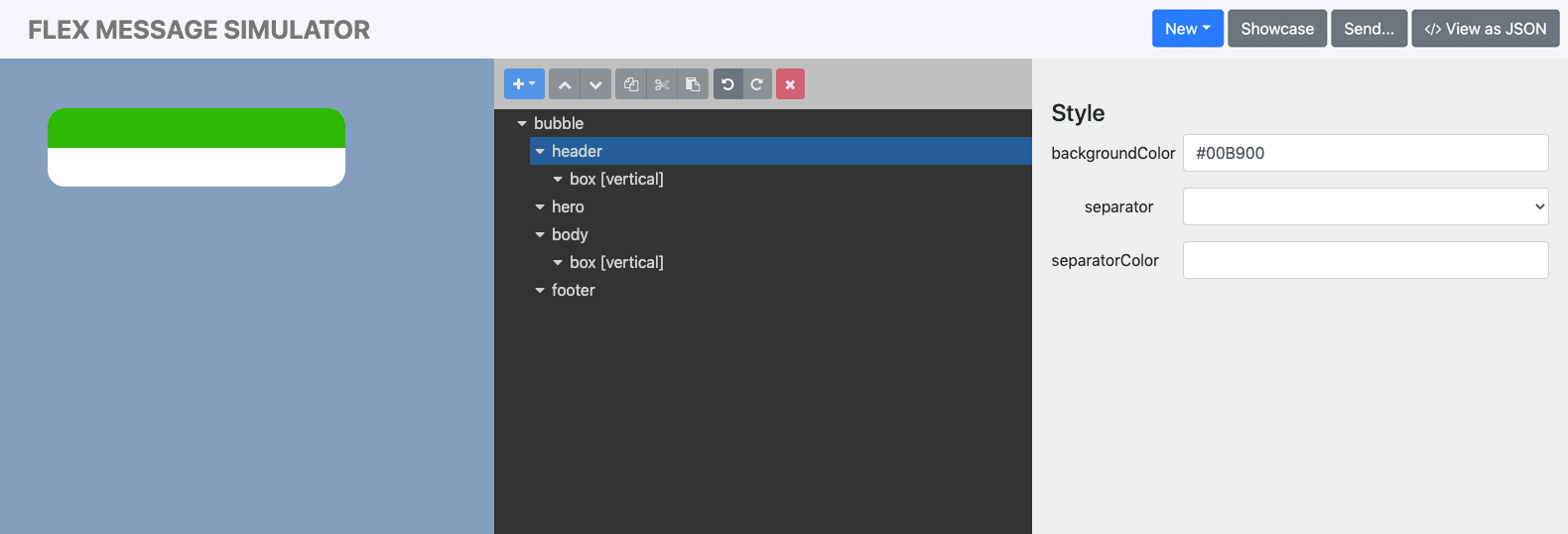
2. Add a header
In the container we created, let's add a header to show the company name. A header is a type of a block and so are hero, body, and footer. Header is mainly used to display the message subject or content heading.
- To add a header, select the header node in the tree view area. Click + at the top and click box.
- Set the background color of the header. In the property area, set the backgroundColor field with hexadecimal color code,
#00B900in this tutorial, and hit the Enter key. Now the header is visually distinguishable from the body block.Hit the Enter key to apply your entryWhenever you add or select a property in the property area, hit the Enter key to apply your entry in the preview area. Then you can see the result in the preview area. From this point onward in this tutorial, we'll omit this instruction to not overwhelm you.
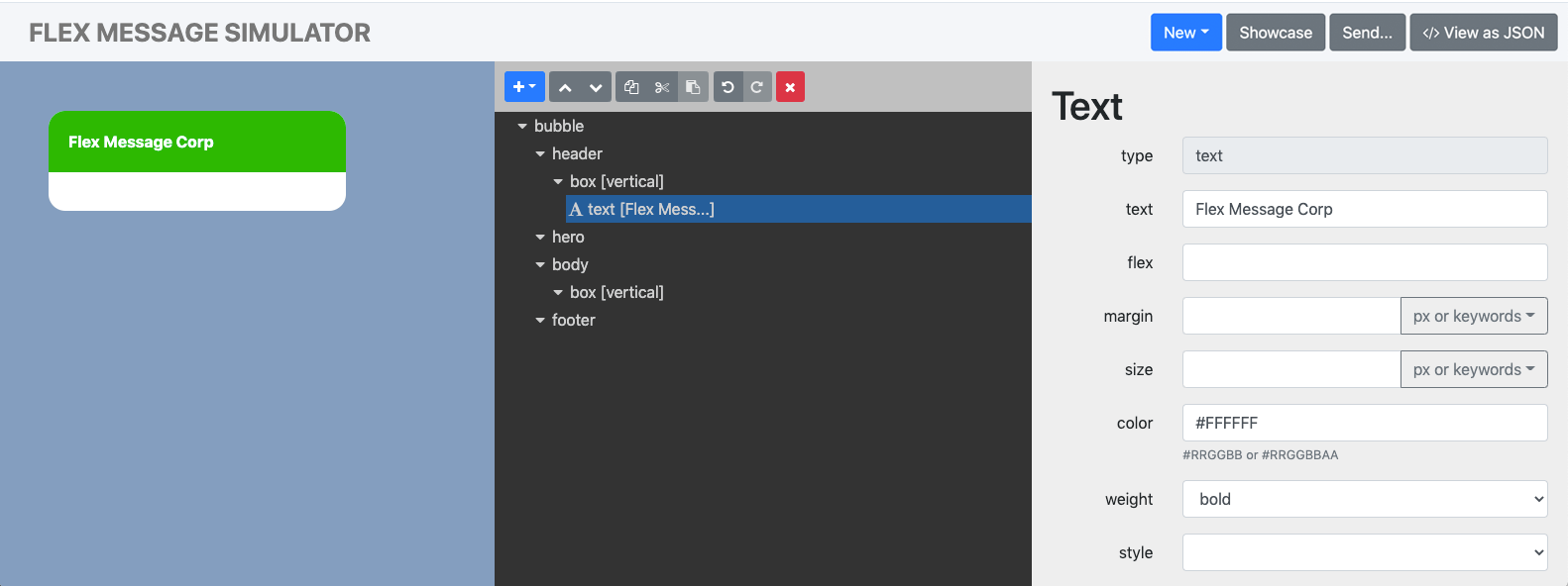
- Add a text in the header:
- From the tree view, click the box vertical node under header.Tip
Vertical box is one of the box types for Flex Messages, that determines how the box's child components are placed within the box. For more information, see Box component orientation.
- Click + in the tree view and then text from the drop-down menu. A text node is created under the box vertical node.
- Click the text node from the tree view.
- In the property area, replace "hello, world" in the text field with "Flex Message Corp".
- From the tree view, click the box vertical node under header.
We made the header distinguishable with the new background color, but the header text is a bit difficult to read. Let's make the text stand out with a new color and style. In the tree view, click the text node and set the color property to #FFFFFF and weight to bold.
Now you should see something like this. We have a distinguishable header with the text clearly visible.
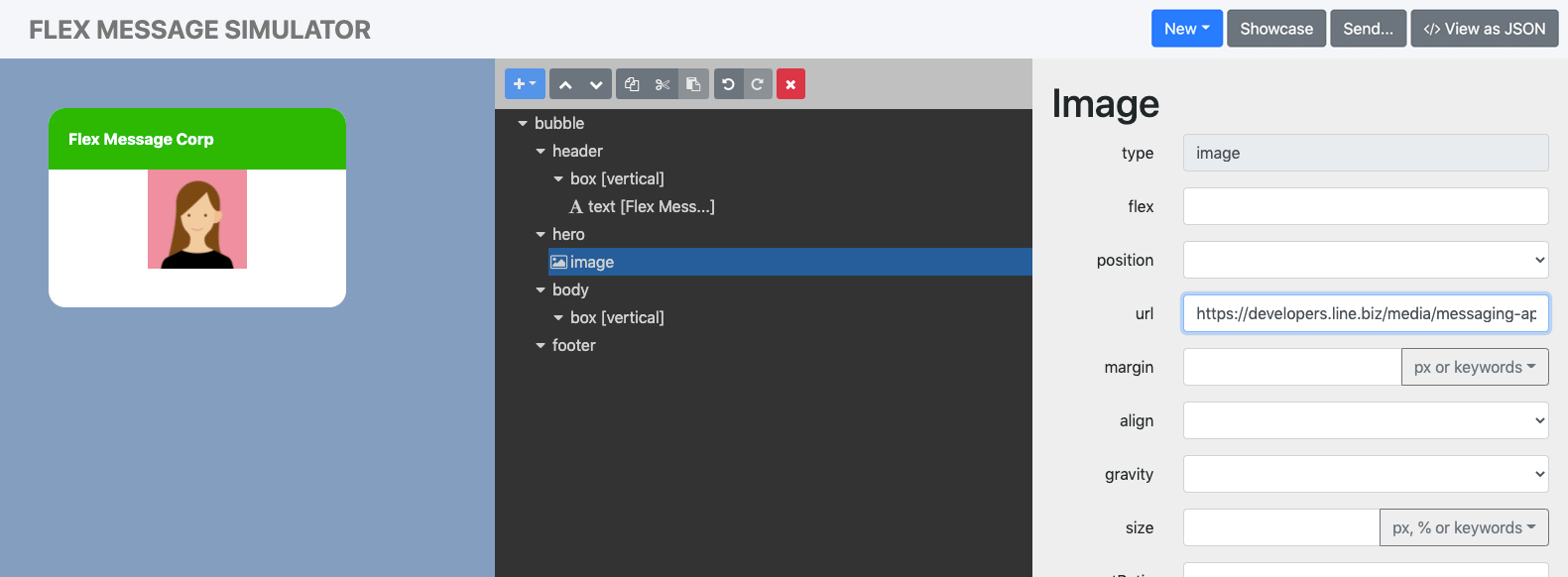
3. Add an image
One way to supplement our a digital business card visually is to add an image. With Flex Message Simulator, adding or styling an image can't get easier. To add an image, we'll use the hero block which is mainly used to display image type content.
- In the tree view, click the hero node.
- Click + and then image from the drop-down list. A default image is displayed in the preview.
- To change the image, click the image node from the tree view. In the property area, change the value of the url property to the location for your image. Your image must be in portrait mode. For the tutorial, you can use this image.Image requirements
You can't upload image files to Flex Message Simulator. Specify a URL to an image that is uploaded on the web. The image and the image URL must satisfy these conditions:
- Protocol: HTTPS (TLS 1.2 or later)
- Image format: JPEG or PNG
- Max image size: 1024 x 1024 px
- Max file size: 10 MB
File size recommendationTo display a message without delay, we recommend that you keep the size of each image file to 1 MB or less.
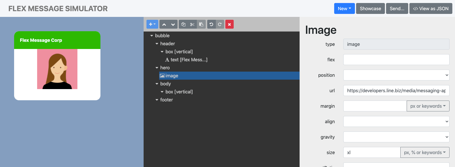
The image is changed successfully, but the image looks a little small compared to the background. Let's make the image bigger.
To change the image size, click the image node from the tree view and set the maximum image width in the size property. For this tutorial, click the button next to the property's input field and the xl keyword from the drop-down list. You can enter a value in pixels or %, instead. For more information, see the "size" property specification for Image.
Now you have a business card with an enlarged image:
4. Add a name
A name in a business card is a must. Presenting key information such as a name in a noticeable style helps. To add a name under the image:
- In the tree view, click the box vertical node under body.
- Click + and then text from the drop-down menu. A text node is created under the box node.
- Click the text node from the tree view.
- In the property area, replace the "hello, world" in the text field with a name.
Like we did with the header text, let's style the name text. We want to increase the font size, make the font bold, and center align the text.
- Size: Set the size property to
xl. (Default size is "md".) - Bold: Set the weight property to
bold. - Center align: Set the align property to
center.
Now your business card has a name under the image:

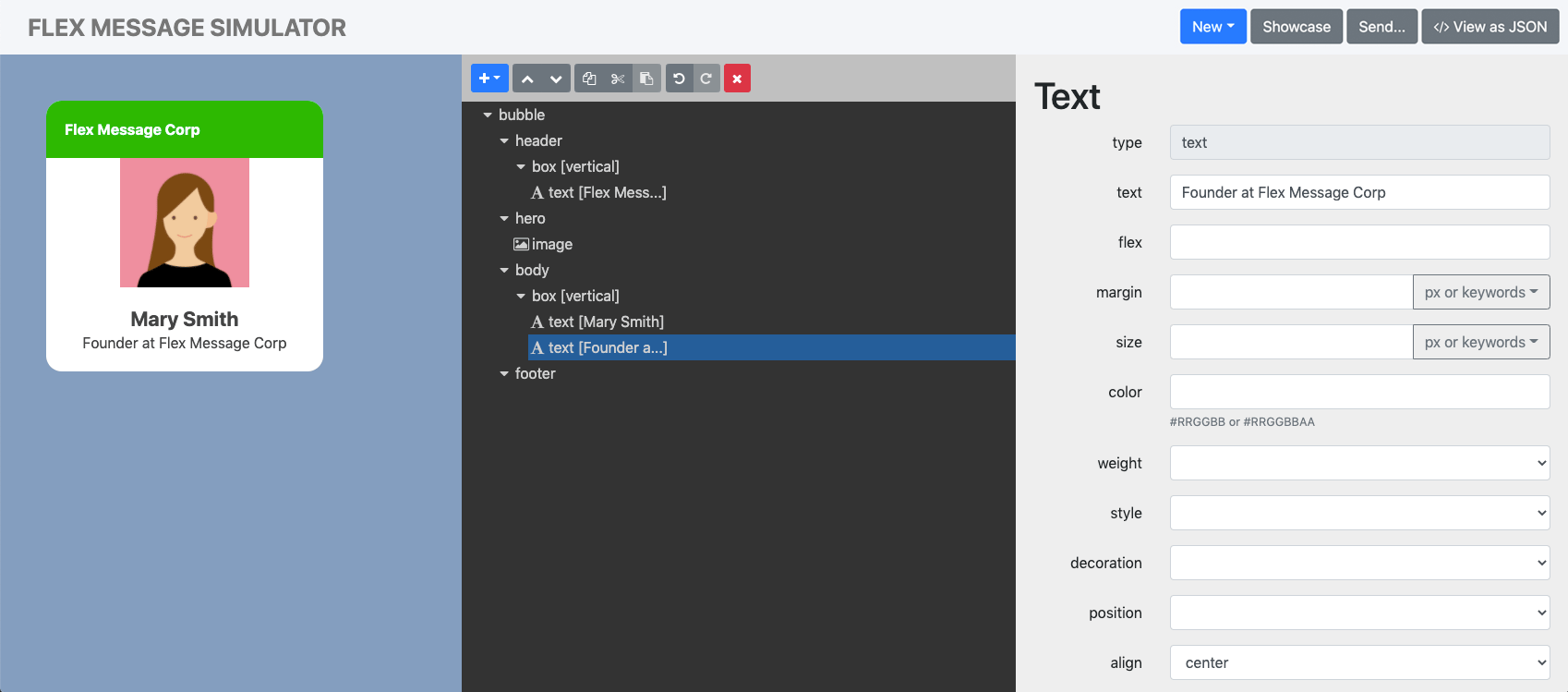
5. Add a job title
Another piece of information as important as a name in a business card is your job title. Let's add a job title under the name.
- In the tree view, click the box vertical node under body.
- Click + and then text from the drop-down menu. A new text node is created.
- Click the new text node from the tree view.
- In the property area, replace "hello, world" in the text field with a job title.
Since we aligned the name to the center, we want to align the job title also to the center. While the text node is selected, set the align property to center.
Now your business card has a job title:
6. Add a separator
Later on, we'll add buttons to make the business card interactive. Before we do that, let's add a separator to visually separate the information section and interactive section.
- In the tree view, click the box vertical node under body.
- Click + and then separator from the drop-down menu. A separator is created right under the job title.
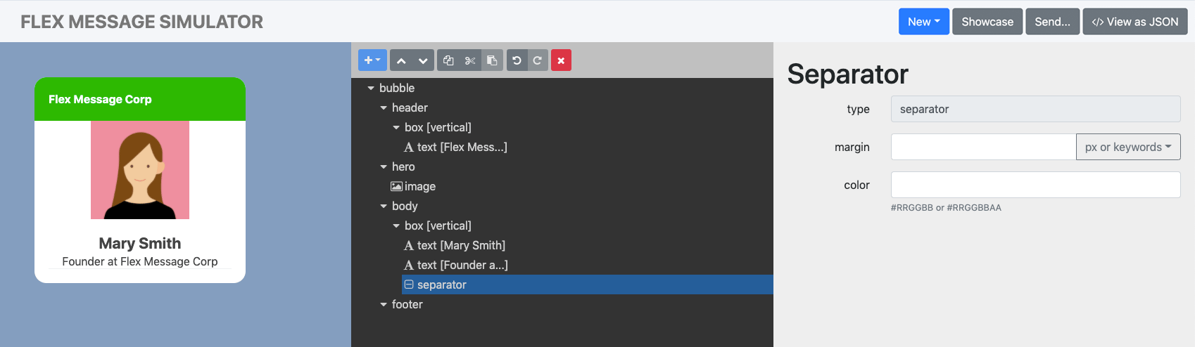
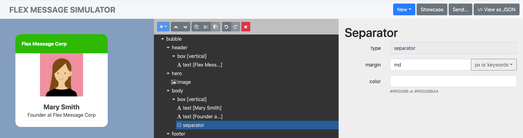
The gap between the separator and the job title is almost none. Let's give a room between the two by giving a margin to the separator. For more information about margins, see Separator in the Messaging API reference.
- In the tree view, click the separator node.
- In the property area, set the margin property to
md.
Now you have a separator in your business card with some room:
7. Add buttons
As mentioned in step 6, we want to add buttons to make our business card interactive. We want to add two buttons under the separator. First, we want a component to group the buttons.
- Click the box vertical under body.
- Click + and then box from the drop-down menu. A box node is created to add buttons to.
We want the buttons to execute an action when pressed. Available action types for buttons are URI action and postback action. For this tutorial, we'll add buttons to:
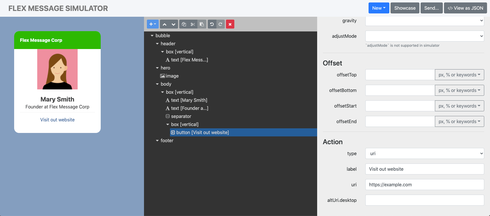
7-1. Add a button to jump to the company's website
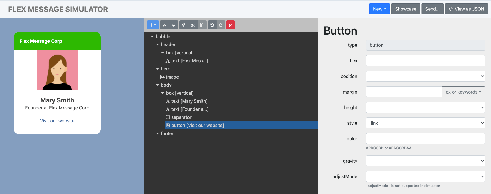
To set a button to open the company's website:
- In the tree view, click the box vertical created for the buttons.
- Click + and then button from the drop-down menu.
- Click the button action node.
- In the property area, scroll down to the Action section. By default, the type property is set to
uri. Since we want to open a website URL, let's keep the value as is. - From the Action section, set the label property to "Visit our website". This becomes the button label.
- To open a website, set the uri property to the URL of your choice.
Percent-encode the domain name, path, query parameters, and fragments in the uri property, with the UTF-8 encoding. For example, the final URL becomes https://example.com/path?q=Good%20morning#Good%20afternoon with these settings:
| Scheme | Domain name | Path | Query parameter | Fragment |
|---|---|---|---|---|
| https | example.com | /path | q=Good morning | Good afternoon |
Now we have a button in the business card to open the company website.
Like we did in the header text, name, and job title, we want to style the button. To make the tappable area more visible, we can add a color to the button. You can choose from three preset button styles to add the color with:
- Primary: Style for dark colored buttons
- Secondary: Style for light colored buttons
- Link: Renders the button like an HTML text link
We recommend that you use the link style if you have multiple buttons stacked vertically, as in our tutorial. Instead of coloring the background, let's apply the link style to our button:
- In the tree view, click the button node.
- In the property area, set the style property to
link.
Your button should look something like this:
7-2. Add a button to open a registration form made with LIFF
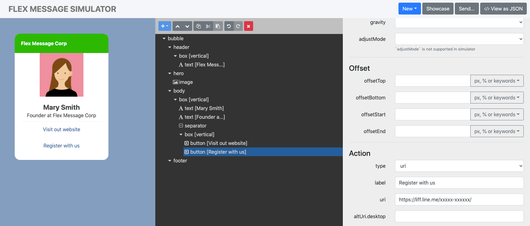
Let's continue to add the rest of the buttons. For the second button, we want to add a LINE Front-end Framework (LIFF) URL to the business' registration form. You can create registration forms with LIFF and later send a new message to the user with the information you retrieved from the form. For more information on LIFF, see Developing a LIFF App or Trying the LIFF starter app.
To create the second button:
- In the tree view, click the box vertical node that you created for the first button.
- Click + and then button from the drop-down menu. A button node is created.
- In the property area:
- Set the style property to
link. - Set the label property to "Register with us".
- Keep the type property to
uri. - Set the uri property to a LIFF app URL.
- Set the style property to
Now we have the second button set with a LIFF URL:
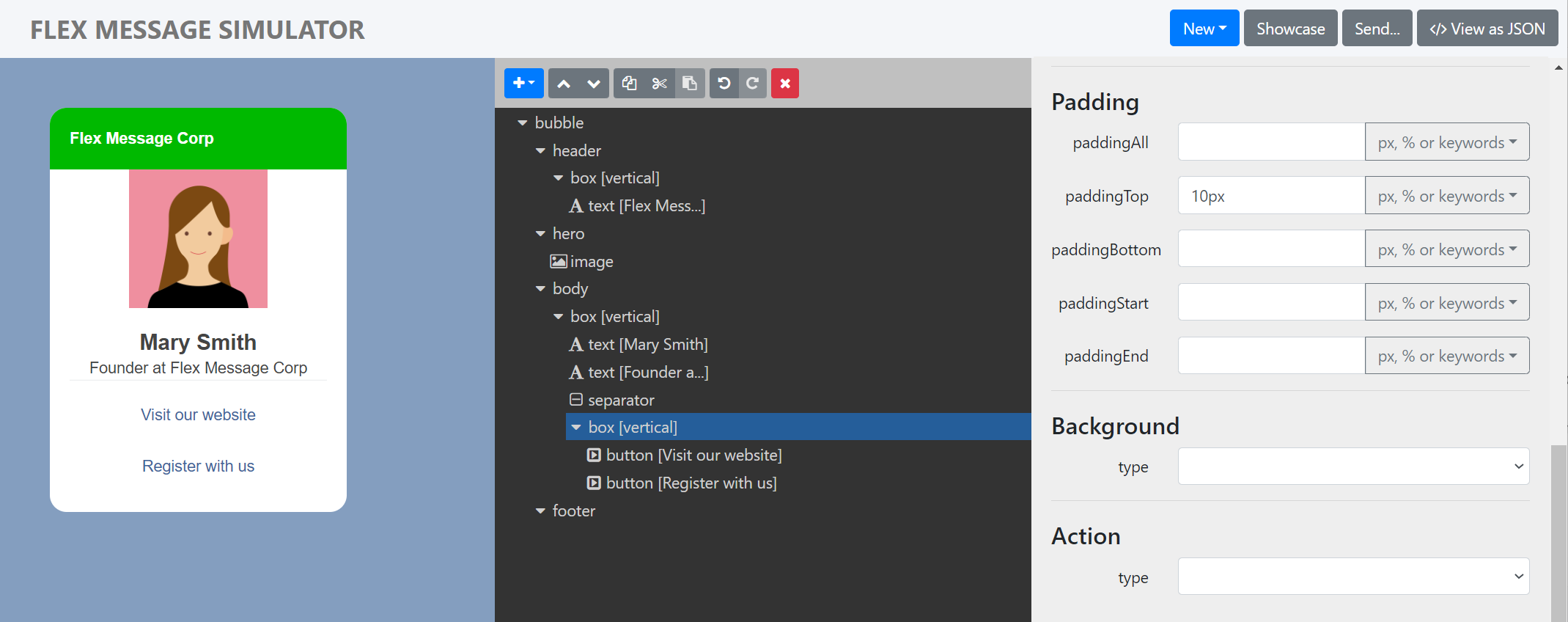
7-3. Distribute the buttons
The buttons are stacked very tight to each other. It doesn't look like so, but if you change the button style to primary or secondary, you can tell right away. To distribute the buttons with some room in between, you can use margin or padding on the parent node, which is a box component for us. For this tutorial, we'll add padding:
- In the tree view, click the box vertical that contains the two buttons you created.
- In the property area, under the Padding section, set the paddingTop property to
10px.
Now we have the buttons with more space in between:
This is it. You completed this tutorial to create a digital business card!
Next steps
When you compose a Flex Message, export the result in JSON as introduced at the beginning of this tutorial. This is handy when you want to send a Flex Message with the Messaging API. For more information, see Call the Messaging API to send the Flex Message.
Conclusion
Flex Message Simulator is a simple tool to help you brainstorm, design, and prototype a Flex Message without writing code. Like this tutorial, there are a limitless number of use cases you can use Flex Messages for. Use Flex Message Simulator to conceptualize ideas, test prototypes, and speed up the creation of Flex Messages, without technical barriers. Create unique Flex Messages with Flex Message Simulator!
Related pages
- Send Flex Messages
- Flex Message elements
- Flex Message layouts
- Flex Message (Messaging API reference)