LINE MINI App UI Components
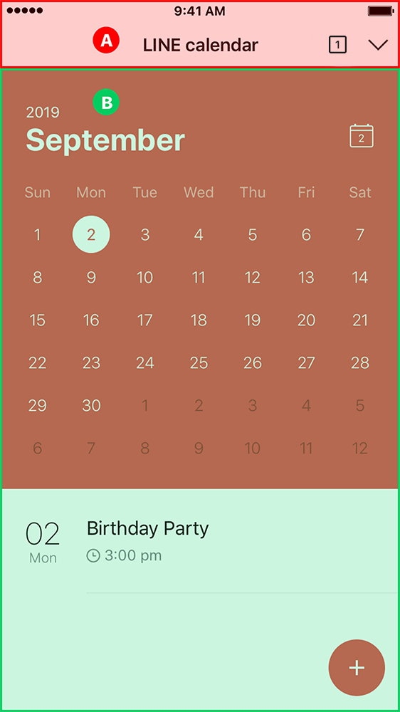
LINE MINI App page consists of (A) Header and (B) Body
Header
Platform-native components are used in the LINE MINI App header, which is automatically generated by LINE.
The header is composed of the following components:
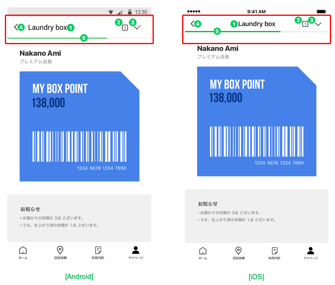
| Number | Component | Description | |||||||||
|---|---|---|---|---|---|---|---|---|---|---|---|
| 1 | Service Name | Specified on the LINE MINI App page<title>. The elements are displayed. You cannot set the font. | |||||||||
| - | Subtext | In unverified MINI Apps, the domain of that page will be displayed under Service Name. In verified MINI Apps, the LINE MINI App name and verified badge will be displayed under Service Name. | |||||||||
| 2 | Action button | Tapping the action button displays either the multi-tab view or the options. This depends on the LINE app version. In LINE version 15.12.0 or later, the multi-tab view will be displayed, and in LINE version earlier than 15.12.0, the options will be displayed. | |||||||||
| 3 | Close Button / Minimize Button | Which button appears, the close button or the minimize button, depends on the LINE version and the type of the LINE MINI App.
| |||||||||
| 4 | Return Button | Displays the previous page. | |||||||||
| 5 | Loading Bar | Displays load status of the current page. |
Body
WebView is used for the body. Utilize HTML5 and LIFF for when developing each of your services.
For more information on LINE MINI App development specifications, see LINE MINI App Specifications.