Implementing a custom action button
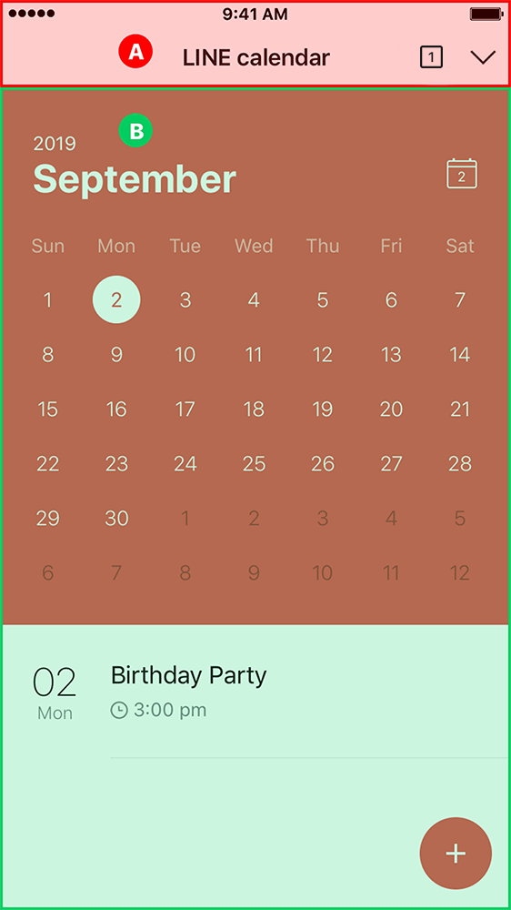
LINE MINI Apps come with a built-in action button in the (A) header that enables users to share the currently-opened page with their friends. As this action button is implemented by LINE and is displayed by default, the behavior of the button and the content of the share message can't be customized.
However, if you implement a custom action button in the (B) body, you can customize the content of the share message before sharing the LINE MINI App.
Guidelines
When you implement a custom action button to enable sending custom share messages, follow these guidelines to help your users understand the content of the message quickly and accurately.
If you cannot meet the design requirements herein because of the nature of the service you provide, contact us at mini_request@linecorp.com.
As of December 13, 2023, the LIFF URL of the LINE MINI App has been changed to https://miniapp.line.me/{liffId}.
If a user accesses existing https://liff.line.me/{liffId}, the LINE MINI App will also open. Therefore, you can continue to use the QR code that you've already issued.
Using share target picker
Implement a custom action button in the body and display the target picker (screen for selecting a group or friend) when the button is tapped. When the user selects the recipient in the target picker, the user can send the share message created by the developer, such as Flex Message.
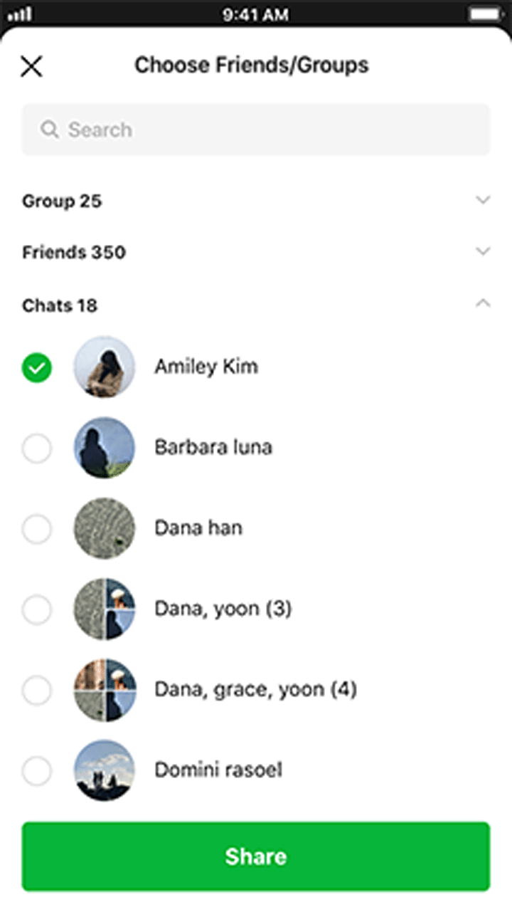
See Sending messages to a user's friend for detailed guide on using the share target picker.
Custom share message format
Use a Bubble container of the Flex Message to compose custom share messages. Do not use a Carousel container of the Flex Message.
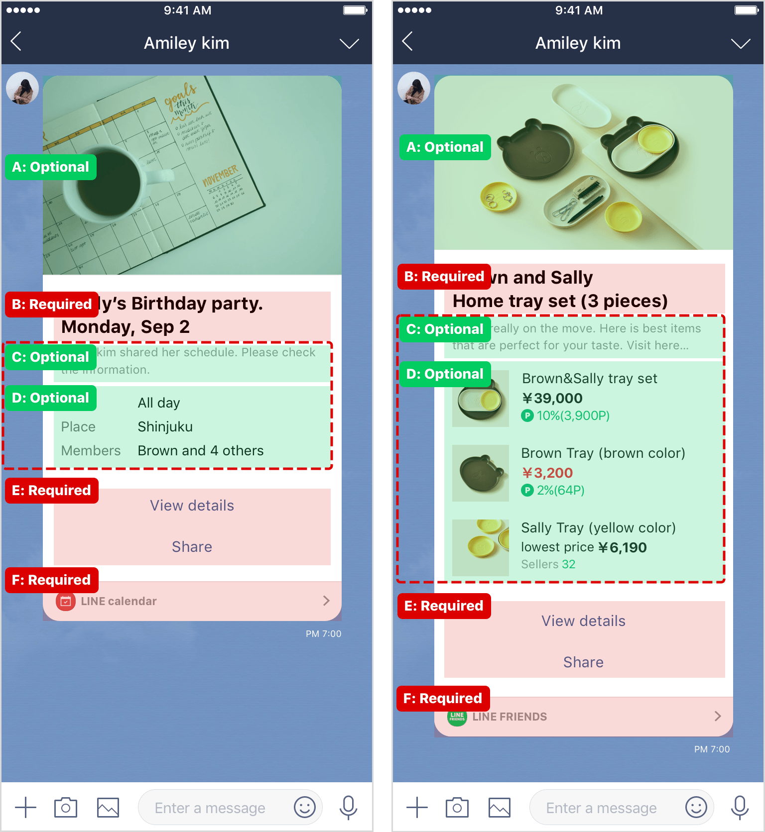
The custom share message includes standard type and image list type, both of which are then respectively divided into sections A to F below:
| Label | Section | Required | Description |
|---|---|---|---|
| A | Image | Optional | Image size must be small enough for the whole message to be contained within the screen, eliminating the need for scrolling. |
| B | Title | Required | Summarize the content of the message. |
| C | Subtitle | * | This is the subtitle of your message. |
| D | Detail | * | A list of items with a label and description: The maximum number of items differs between the standard type and the image list type:
|
| E | Button | Required |
|
| F | Footer | Required | Compose with your LINE MINI App icon, LINE MINI App name, and a image  . Don't change this image. Specify the URI action to display the LINE MINI App top page ( . Don't change this image. Specify the URI action to display the LINE MINI App top page (https://miniapp.line.me/{your-liffId}) when the user taps this image. |
* You must insert either C, the sub-title or D, the detail section. You may use both.
Standard type
For standard types of Flex Message, follow these guidelines:
For an example JSON file, see Example JSON file following guidelines.
- Actions can only be set on the specified components of buttons (E) and footer (F).
- Don't change any properties not described here.
Standard type - Image (A)
Put the image (A) in the hero block.
| Label | Section | Type | Description |
|---|---|---|---|
| A | Image | Hero block > Image |
|
Standard type - Body
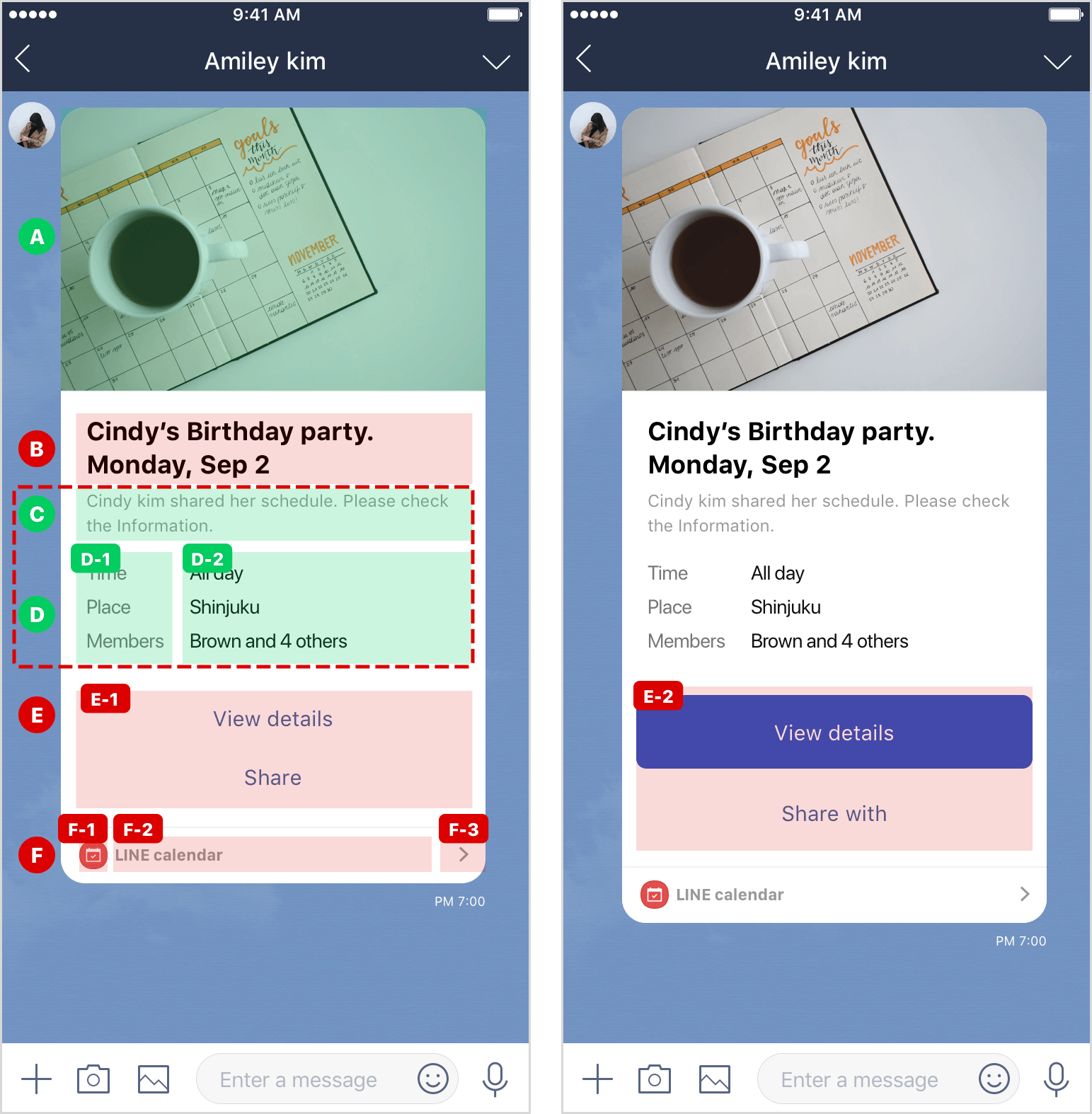
Specify the body block that contains the title (B), sub-title (C), details (D), and buttons (E) as follows:
| Label | Section | Type | Description |
|---|---|---|---|
| - | - | Body block > Box |
|
Standard type - Title (B)
| Label | Section | Type | Description |
|---|---|---|---|
| B | Title | Box |
|
| B | Title | Text |
|
Standard type - Sub-title (C)
| Label | Section | Type | Description |
|---|---|---|---|
| C | Sub-title | Box |
|
| C | Sub-title | Text |
|
Standard type - Details (D)
| Label | Section | Type | Description |
|---|---|---|---|
| D | Details | Box |
|
| D | Details - item | Box | This is a box containing only one set of D-1 and D-2.
|
| D-1 | Details - label | Text |
|
| D-2 | Details - description | Text |
|
Standard type - Button (E)
| Label | Section | Type | Description |
|---|---|---|---|
| E | Button | Box | A box containing of E-1 and E-2.
|
| E-1 | Button (When using only link style) | Button |
|
| E-2 | Button (When using primary style) | Button |
|
When using primary style:
Standard type - Footer (F)
Place the footer (F) in the footer block.
| Label | Section | Element | Description |
|---|---|---|---|
| - | - | Footer block > Box |
|
| - | - | Separator |
|
| F | Footer | Box | A box containing of F-1 to F-3.
|
| F-1 | LINE MINI App icon | Image |
|
| F-2 | LINE MINI App name | Text |
|
| F-3 | | Image |
|
Image list type
For image list types of Flex Message, follow these guidelines:
For an example JSON file, see Example JSON file following guidelines.
- Actions can only be set on the specified components of buttons (E) and footer (F).
- Don't change any properties not described herein.
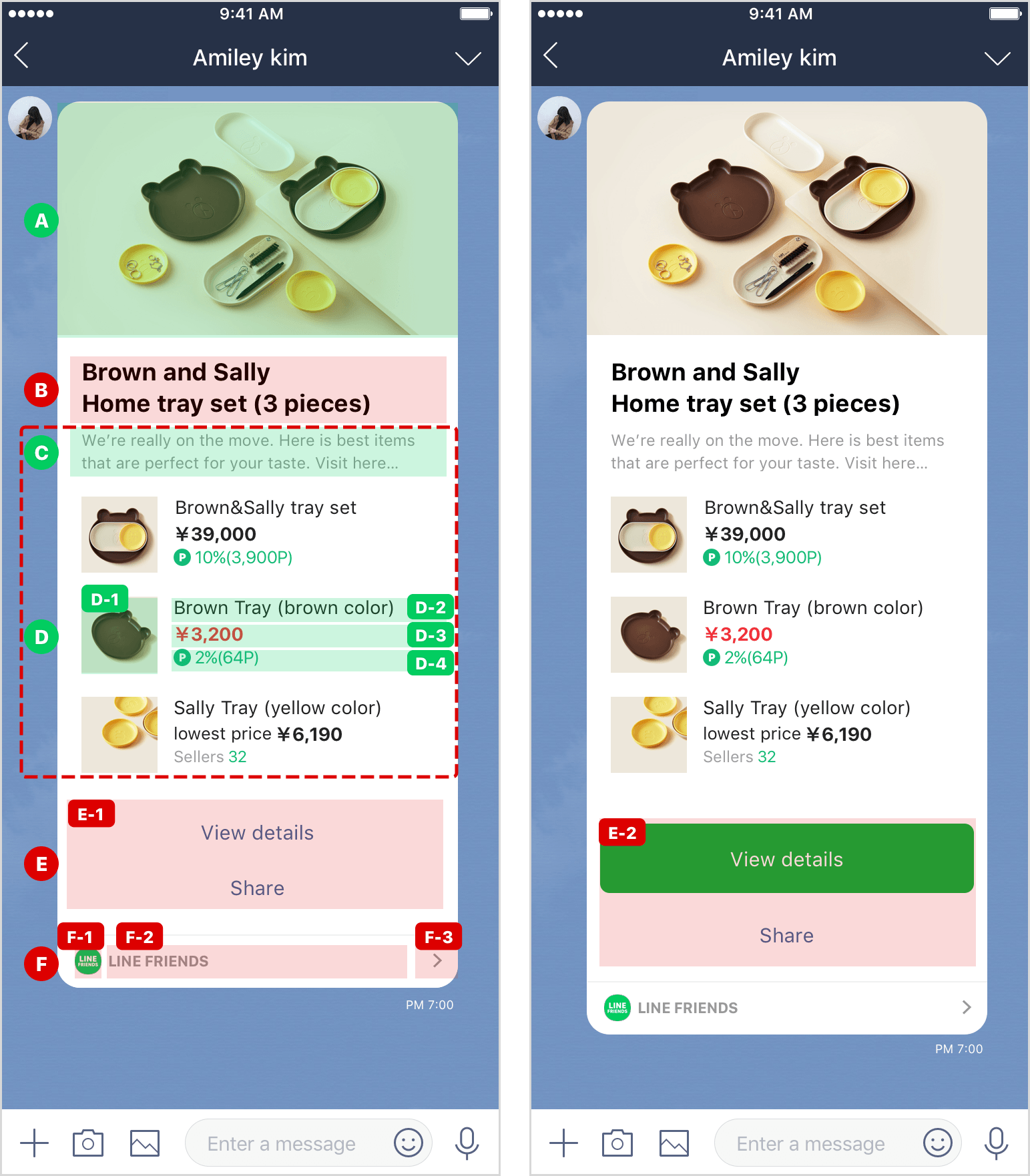
Image list type - Image (A)
Put the image (A) in the hero block.
| Label | Section | Type | Description |
|---|---|---|---|
| A | Image | Hero block > Image |
|
Image list type - Body
Specify the body block that contains the title (B), sub-title (C), details (D), and buttons (E) as follows:
| Label | Section | Type | Description |
|---|---|---|---|
| - | - | Body block > Box |
|
Image list type - Title (B)
| Label | Section | Type | Description |
|---|---|---|---|
| B | Title | Box |
|
| B | Title | Text |
|
Image list type - Sub-title (C)
| Label | Section | Type | Description |
|---|---|---|---|
| C | Sub-title | Box |
|
| C | Sub-title | Text |
|
Image list type - Details (D)
| Label | Section | Type | Description |
|---|---|---|---|
| D | Details | Box |
|
| - | Details - Item | Box | A box containing only one set of D-1 to D-4.
|
| D-1 | Details - Image | Image |
|
| - | Details - Text area | Box | A box containing of D-2 to D-4.
|
| D-2 | Details - General text | Text |
|
| D-3 | Details - Text to emphasize | Text |
|
| D-4 | Details - Image+text | Box | A box containing of image and text of D-4:
|
Image list type - Button (E)
| Label | Section | Type | Description |
|---|---|---|---|
| E | Button | Box | A box containing of E-1 and E-2.
|
| E-1 | Button (When using only link) | Button |
|
| E-2 | Button (When using primary style) | Button |
|
When using primary style:
Image list type - Footer (F)
| Label | Section | Type | Description |
|---|---|---|---|
| - | - | Footer block > Box |
|
| - | - | Separator |
|
| F | Footer | Box | A box containing of F-1 to F-3.
|
| F-1 | LINE MINI App icon | Image |
|
| F-2 | LINE MINI App name | Text |
|
| F-3 | | Image |
|